The brief
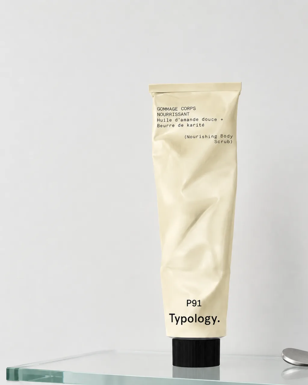
I made this study to see how far skincare product photography can go with almost nothing to lean on. I chose Typology, and the P91 body scrub in particular, because the packaging gives the product nowhere to hide: a plain tube and a short typed label, so the set had to carry everything through texture and light. That became the starting point.
The bigger question was about the brand. I wanted to understand Typology's look well enough to make new images that could sit inside its world, without copying anything it already publishes. It is a self-initiated concept study, made with AI. Typology is not a client and did not commission it.
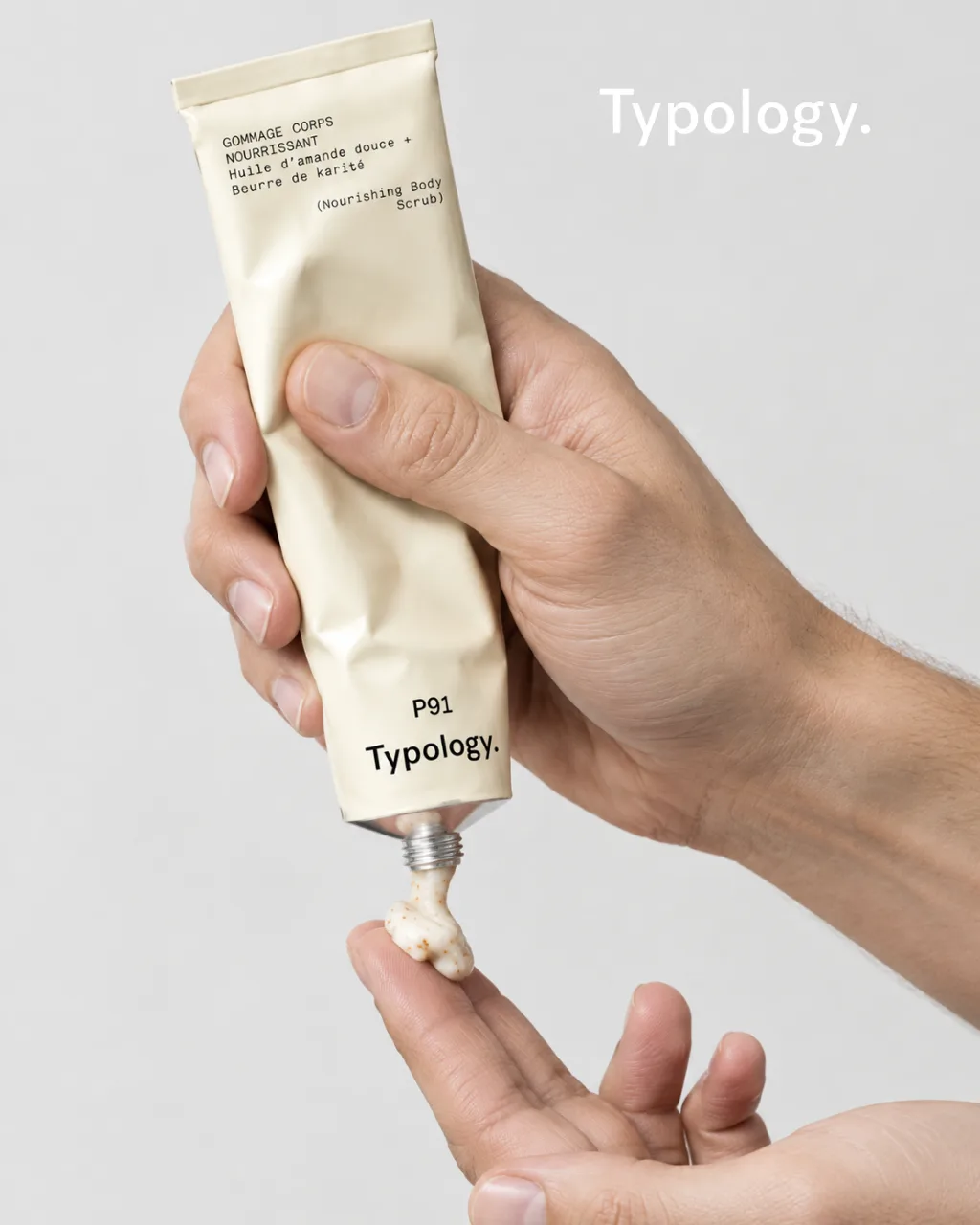
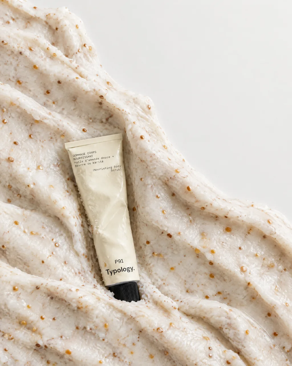
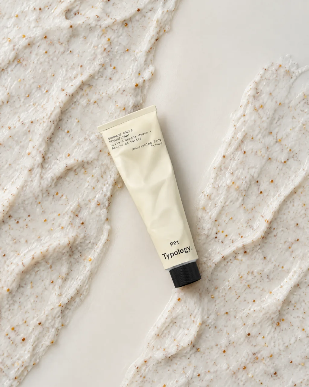
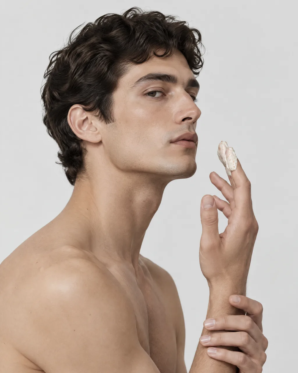
The set is six frames, and each one has a different job. Between them they cover the four shots most beauty brands need: a hero, a texture shot, the product on skin and a set still life.
The direction
The direction for this body-care imagery is as restrained as the brand, with pale neutrals, clear surfaces, silver details, bare skin and simple compositions. The light is soft and even on pale grey and off-white grounds, so the cream of the tube and the amber grains in the scrub carry what little colour there is.
For the two texture frames I went closer than a catalogue would, close enough to see each grain sitting in the white base. Silver comes in through two small things, the threaded metal neck of the tube and a brushed steel disc beside it on the glass shelf.
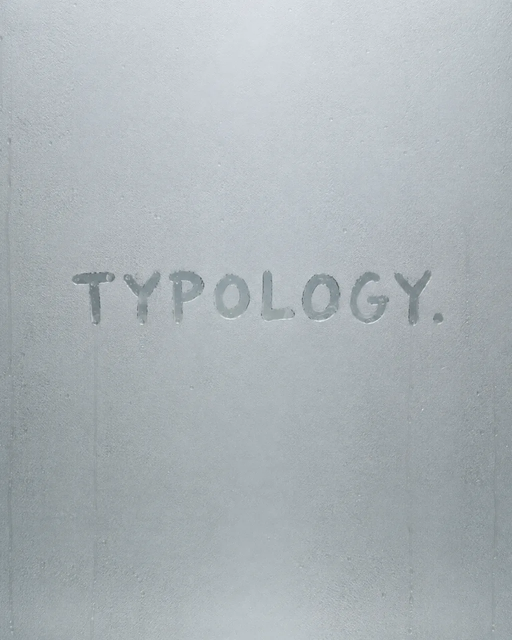
One male model carries the on-skin frame, with dark curly hair and bare shoulders. I chose a male model to reflect the brand's broader audience and show how the product fits naturally into a man's routine, in a category where women are more often the focus. The brand details are just as quiet. The label gives the French name first, Gommage corps nourrissant, with the English underneath in brackets, and the name drawn in the steamed mirror keeps the full stop from the wordmark.
What was hard
The challenge was keeping the product believable from frame to frame. The scrub had to read as the same formula in a mound, in a thin streak and on a fingertip, with the same white base and amber grains each time. The tube had to stay recognisable at every angle and crop, and the label reads word for word the same wherever it is visible.
Hands and labels are two of the details I never leave broken, and the key visual has both, one hand squeezing the tube while the other catches the scrub. A product master first: the tube and the label were built once and set into each frame, then the grains and the streaks were matched by hand.
Every frame was retouched and colour-graded by hand at the end, and matched so the six read as one set rather than six separate images.