The brief
Aesop Virēre is a self-initiated study in AI perfume photography. Virēre is an Aesop eau de parfum in an amber glass bottle, and Aesop had no part in this project.
I've admired Aesop for years, particularly its distinctive visual language and thoughtful approach to scent. Virēre is one of my favourite fragrances from the brand, so it felt like a natural starting point for a personal project exploring my own interpretation of a scent I know and love.
The question I set myself was how closely I could read a brand whose visual language is already settled, then make new imagery that belongs inside it. I treated it as a study of the fragrance through surface, light and controlled atmosphere. The brief was not to make Aesop louder. It was to understand why it stays quiet.
It is also a test of a worry I hear often. Most premium brands I speak to are nervous about what AI imagery might do to a brand built on feeling considered, and a brand this restrained is a good place to find out whether that worry is fair. Every frame here is made with AI and finished by hand.
The direction
Luxury product photography in Aesop's world is quiet, so I started by reading the brand. Before generating any images, I developed a detailed visual brief defining the palette, lighting, textures and use of space to guide the project's art direction. It came down to warm amber, bark, stone and dry moss, never saturated, and directional light that leaves real shadow, with plenty of space around the bottle.
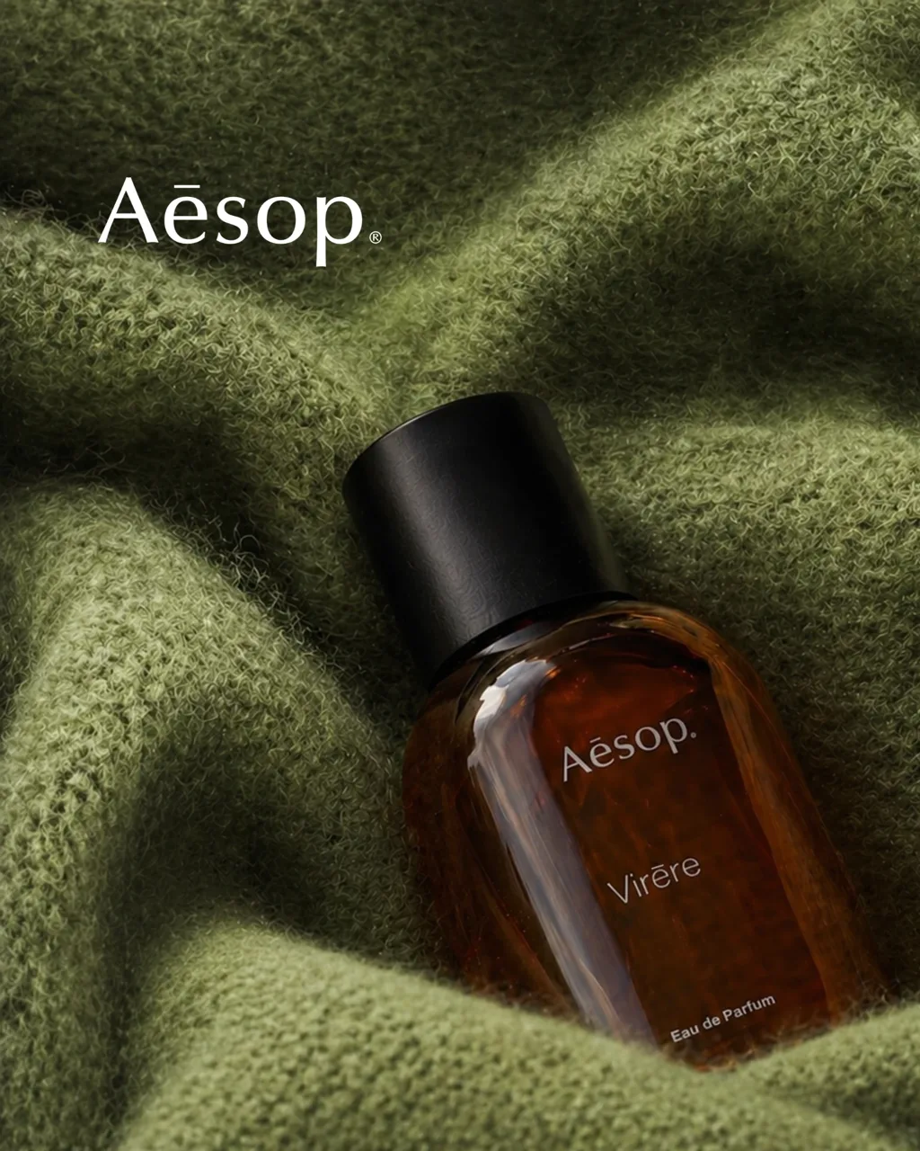
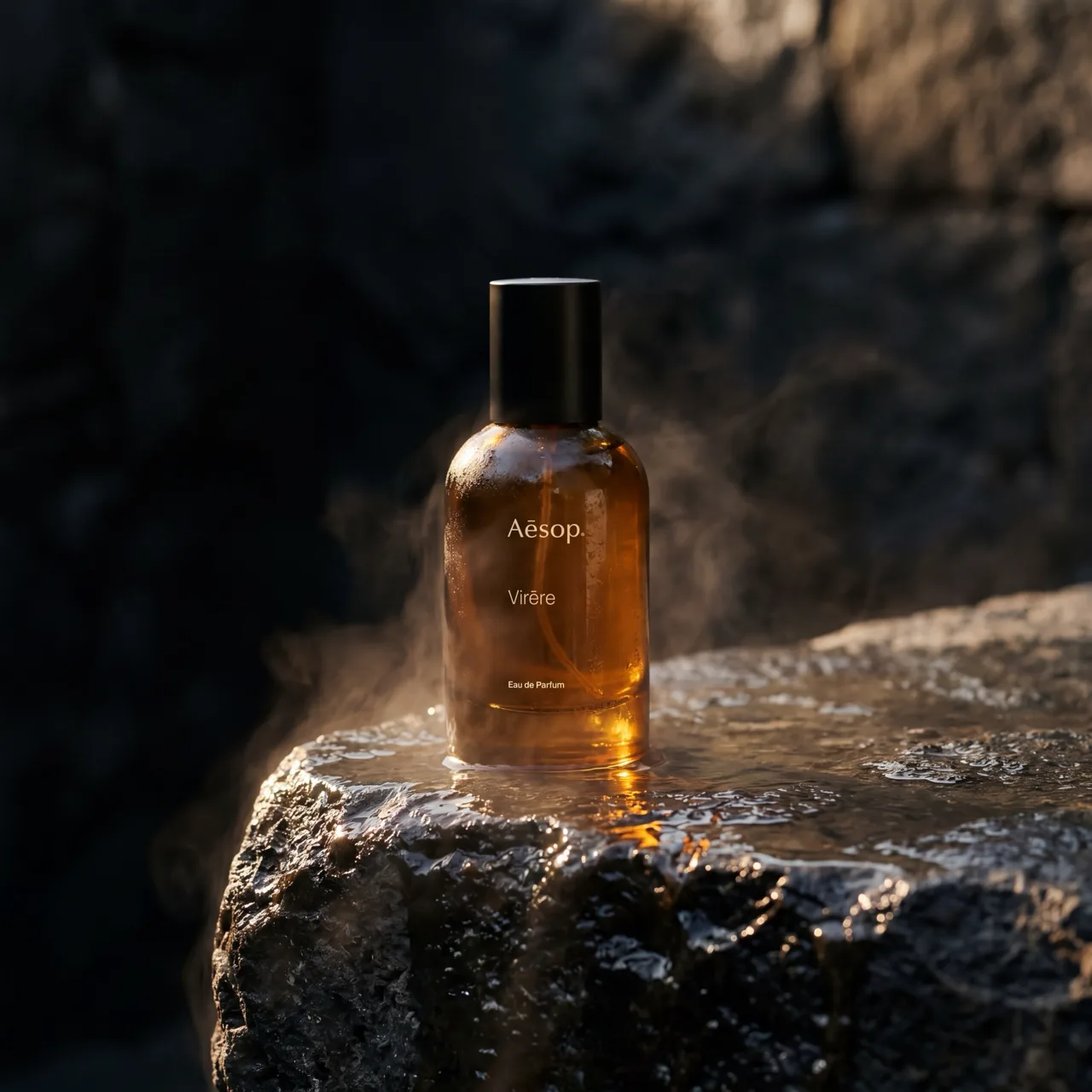
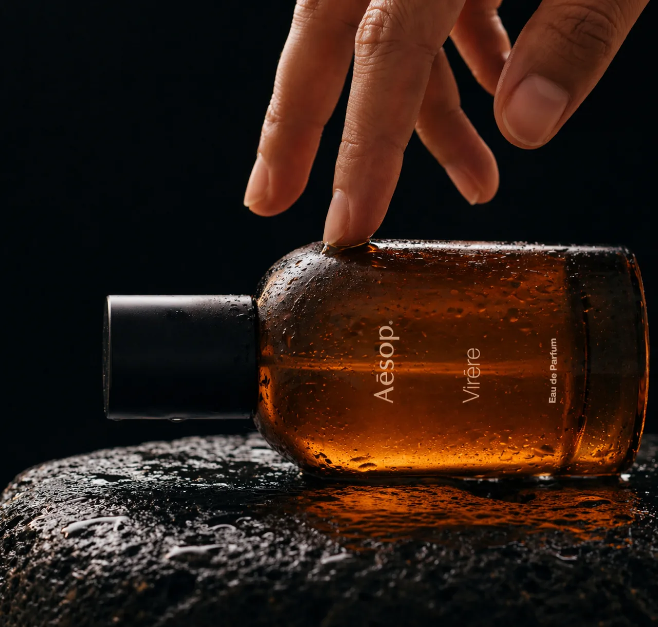
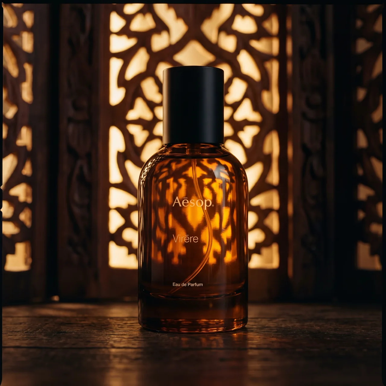
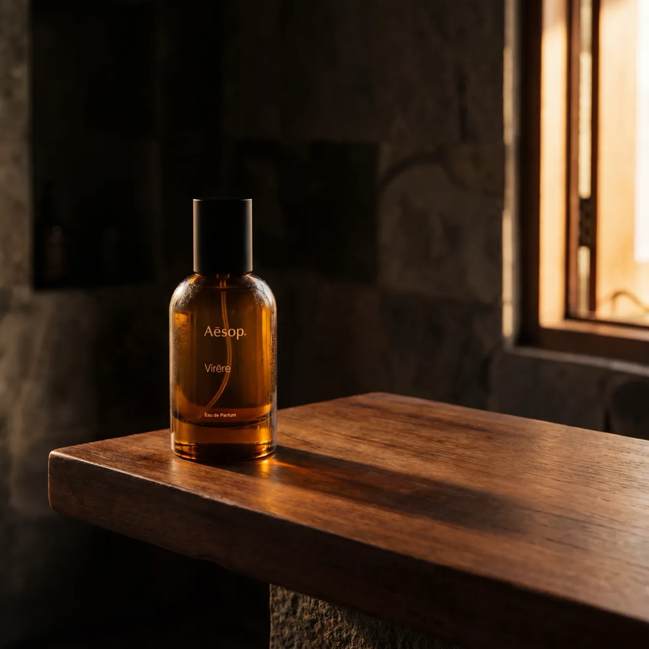
My first drafts put the bottle on a forest floor among moss and fern, on a bare beige plinth and on cashmere draped over a woven chair. None of those made the final set. The forest and moss drafts felt too lush and literal. They illustrated the fragrance's botanical notes, but didn't capture the restraint I associate with Aesop. I moved towards sparser compositions and more weathered textures to suggest the scent while keeping the imagery aligned with the brand. What stayed was a run of tactile settings, each in its own light: wet stone in cave mist, a fingertip on the wet bottle against a dark ground, a carved wooden screen glowing from behind, a wooden ledge by a window, and green cashmere for the key visual.
There is no face anywhere in the set. The only person is a hand, which puts scale on the bottle and keeps the eye on the glass.
What was hard
The bottle had to stay the same bottle while everything around it changed. That meant the amber glass, the black cap, the proportions and a label with a macron in both names, Aēsop and Virēre.
Scale was a quieter problem. With no person in most frames, only the hand shows how big the bottle really is, so every other frame had to agree with it. The glass added a second difficulty. Amber shifts with whatever sits behind it, so the bottle reads differently in the cave mist and in front of the carved screen, and it still had to be recognisably the same amber in each. I worked from a reference image of the real bottle throughout.