The brief
The brief was to launch a serum that does not exist. HYDRA° is my own concept brand, so I set the brief myself and treated it as a real launch. It needed a full set of AI skincare product photography, from the bottle on a plain ground to the serum on skin.
I wanted a brand world that feels clinical and calming while staying soft and desirable. The images had to sell the feeling of hydration and keep the product story simple. I imagined HYDRA° for women aged 22 to 30, as a serum that fits into a simple, everyday skincare routine, priced to sit alongside The Ordinary on a UK shelf.
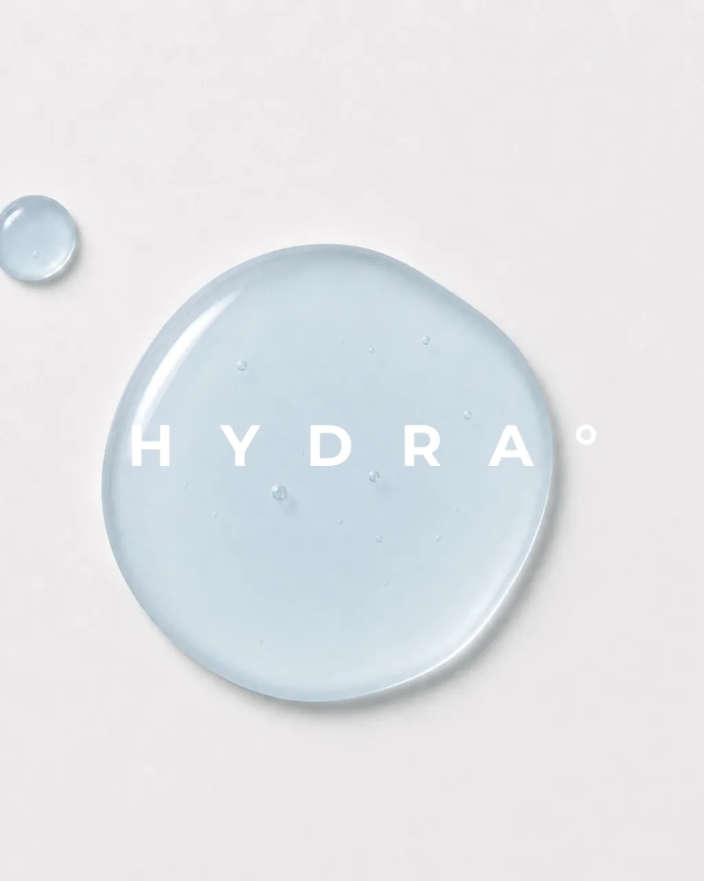
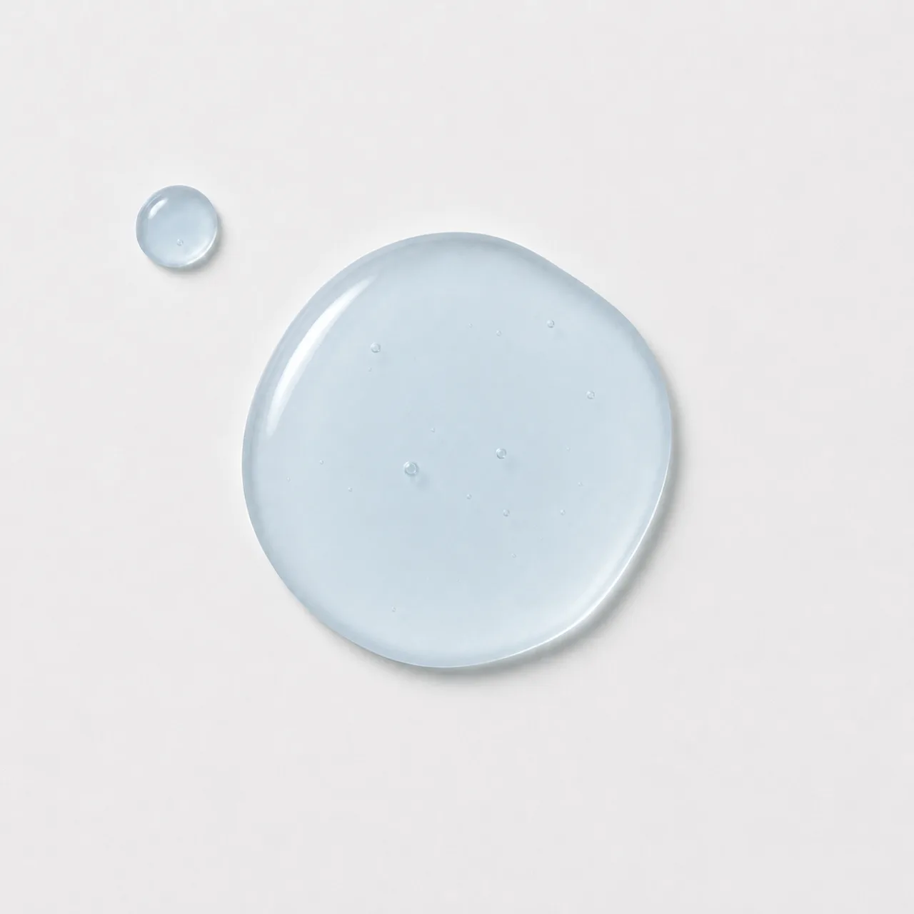
That meant a set with clean product shots, glass, pale blue liquid, moving water and close-up application. At its centre is the drop, because the way a serum moves and sits on skin is the nearest a still image gets to showing that it works.
Nobody commissioned HYDRA° and nothing was photographed. Every frame is made with AI, and there was no studio day behind any of them. The finished set is six frames: four portrait images and two square macros.
The direction
HYDRA° sits at the soft, luminous end of my range. Much of my work lives in warmer, shadowed light, and this set shows the other side of it.
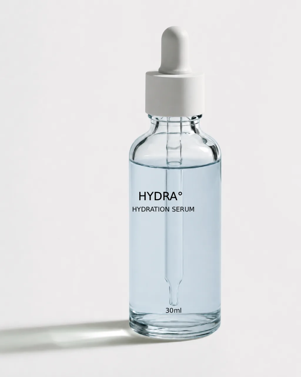
The palette is short. A white to pale grey ground, clear glass, a white dropper and a serum in a pale, watery blue. The bottle is a 30 ml glass dropper, its label little more than HYDRA° over HYDRATION SERUM in small black type. Light stays soft and even, with a single shadow falling away from the bottle in the hero.
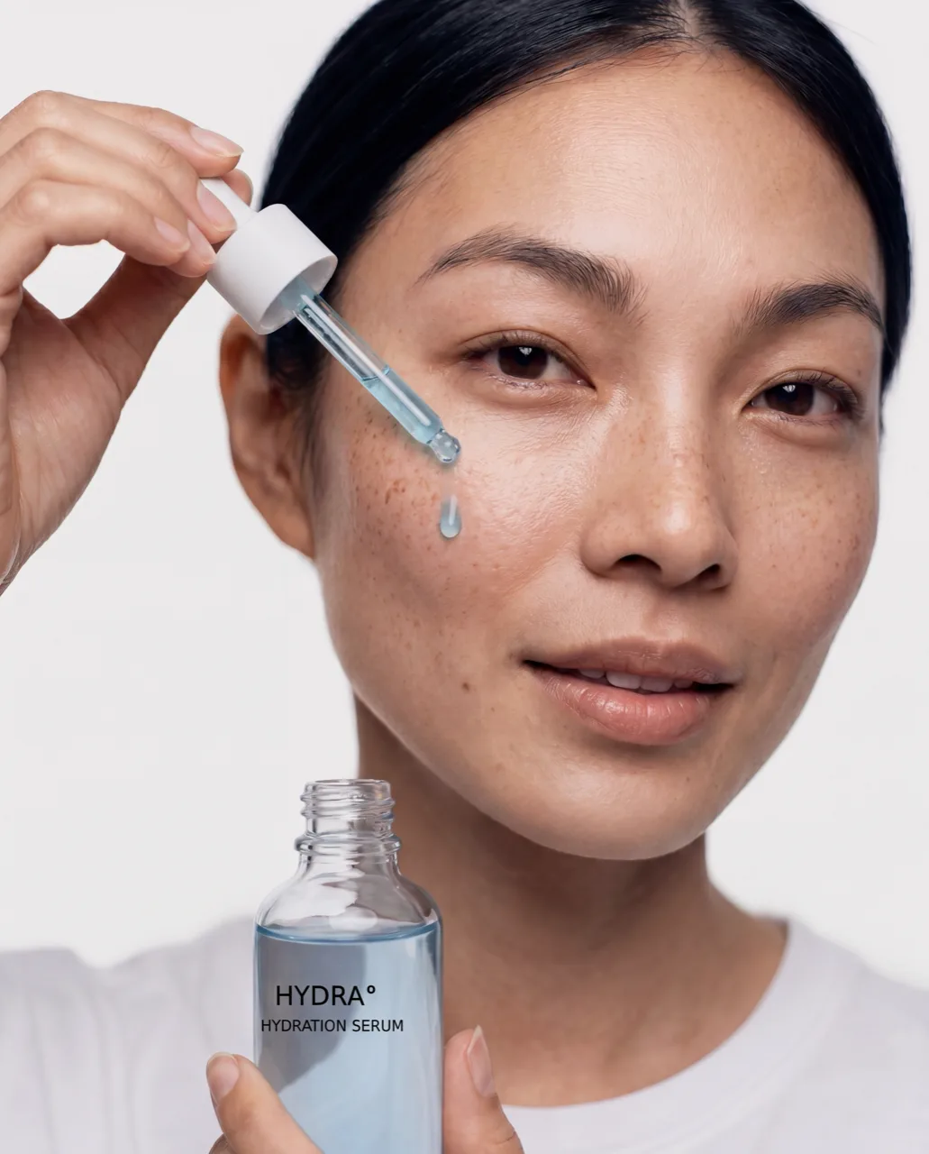
For the ritual frame I cast one woman, in a plain white T-shirt with her hair pulled back, and kept her freckles and the texture of her skin.
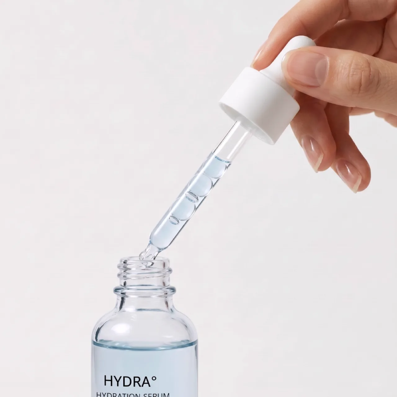
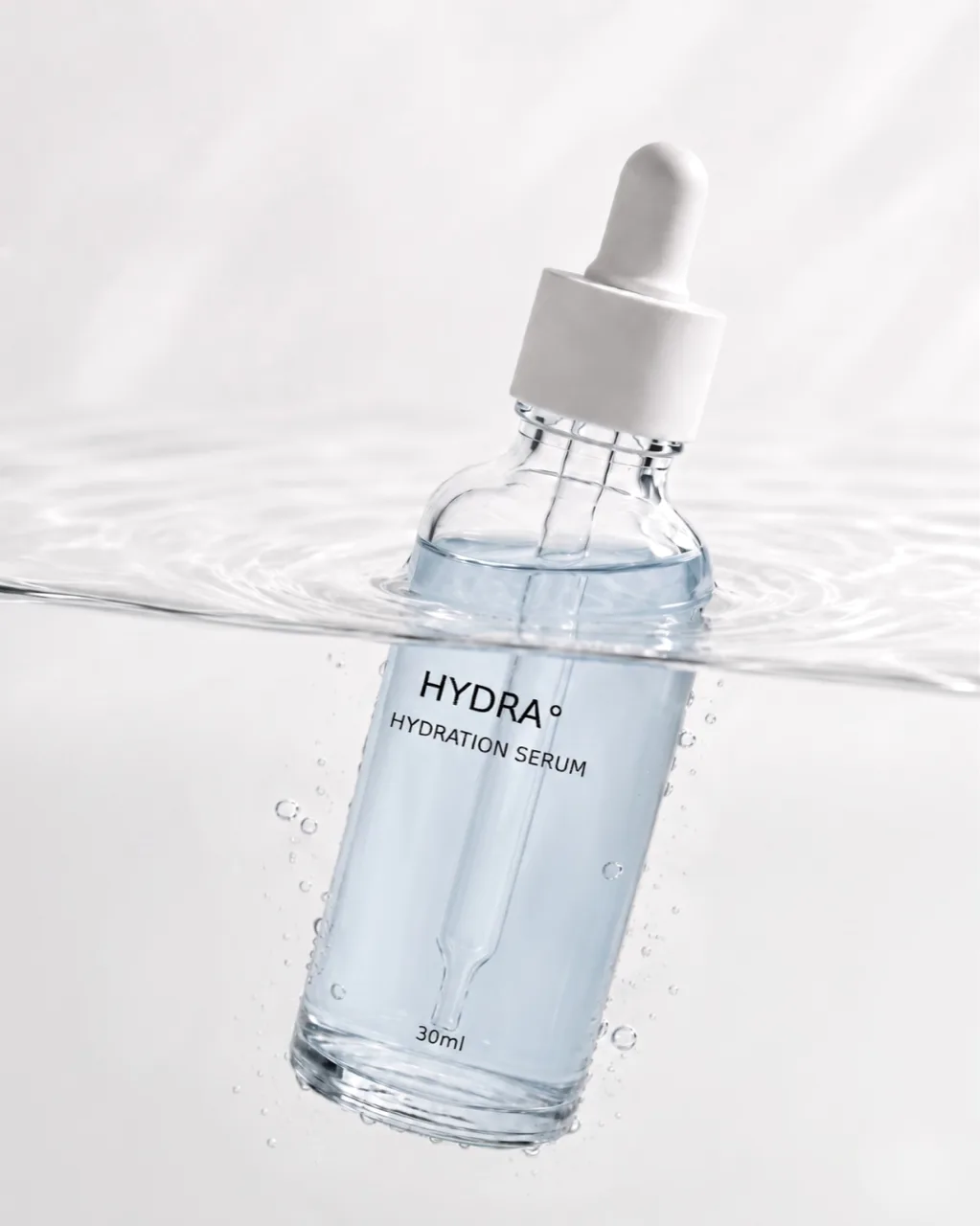
Each frame does one of the four jobs I think most beauty launches need. The bottle on its own is the hero. The drop and the pipette pull are the texture and macro frames, and the key visual sets the name inside the drop. The ritual puts the serum on skin, and the bottle tipped at the waterline gives it a world.
What was hard
Liquid was the hardest part. The drop and the pipette pull each took several attempts before the serum moved slowly and caught the light the way a real one would. The AI-generated frames were the starting point, and I refined them by hand to get the liquid looking the way I wanted. That finishing work was an important part of making the serum feel believable and keeping both macro images consistent with the rest of the campaign.
The colour drifted early on, with the first bottles coming back a saturated blue and then closer to mint before the serum settled at the pale blue in the finished set.
The label needed care too. Type on glass is where AI beauty product photography often gives itself away, so I built the bottle without text and set the label on afterwards. I placed it again on the bottle she holds in the ritual frame.
I tried the water frame several ways. Early versions floated the bottle in a bright blue pool seen from above. The one I kept tips it at the waterline against the same pale ground as the rest, with ripples and fine bubbles along the glass. Keeping one look across a set comes down to decisions like that, with each new frame checked against the ones already finished.