Beauty product photography: what actually works

Beauty is the hardest product category to photograph well, and the easiest to photograph blandly. A lipstick bullet on a white sweep is technically a product shot. It just does not sell anything. Here is what a beauty image actually has to do, the shots most brands end up needing, and how to tell a good set from a competent one.
What a beauty image has to do
Most product photography has one job: show the thing clearly. Beauty has three, and they pull against each other.
It has to be accurate, because a foundation shade that photographs half a tone warm generates returns. It has to be desirable, because nobody buys a serum for its dispenser. And it has to look like your brand rather than the category, which is the part most sets miss. Put ten prestige skincare heroes side by side with the labels removed and you often cannot tell them apart.
Accuracy and desire are craft problems. The third is a direction problem, and it is the one that decides whether the images are worth what you paid.
The four shots most beauty brands need
Almost every beauty launch I have worked through, including the concept campaigns in the portfolio, resolves into the same four:
The hero. The product, lit and placed so it reads instantly at thumbnail size. This is the one that has to survive being 200 pixels wide in a grid, so silhouette matters more than detail.
The texture shot. Cream, powder, balm, the actual substance. This is where desire lives. A blush is pigment pressed into a pan until you show what it does when a brush hits it. The Charlotte Tilbury concept set is built around exactly that: a heart pressed into the powder and a brush bursting with pigment.
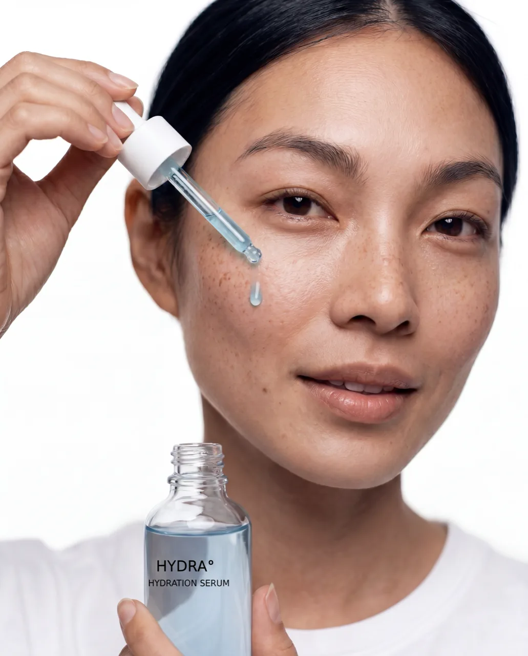
The product on skin. Swatches, a hand, a mouth, a cheek. The hardest of the four, because it needs anatomy and finish to be right at the same time, and it has to work across skin tones rather than one.
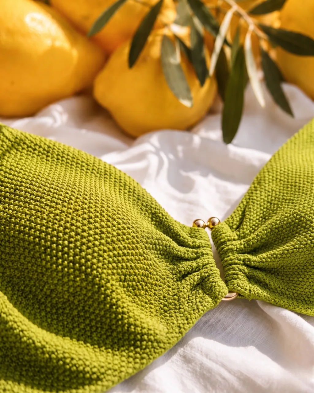
The set still life. The product in a world: surfaces, light, props that imply where this belongs. This is the shot that carries the brand rather than the SKU.
Retail partners usually want the first, and the e-commerce spec for it is rigid. The other three are what your own channels run on.
Why beauty is harder than it looks
Four things make this category punishing, and they are worth knowing before you brief anyone.
Glass and reflection. A serum bottle is a mirror. Every light, every surface and often the camera itself ends up in it, and cleaning that up without killing the sense of glass is fiddly work.
Liquid behaves once. A drop pulling from a pipette, a cream breaking as it is dispensed. These are single moments, and on a traditional shoot you buy them with time and repetition. The HYDRA set has both of those frames, and each took several attempts to land.
Finish is the whole product. Matte, satin, gloss, shimmer and metallic are the difference between two lipsticks that are otherwise the same object. If the finish reads wrong, the image is wrong, however beautiful it is.
Skin tones are not a variant. A swatch range has to stay true across every tone it appears on, and consistency across that range is a discipline rather than a filter.
Where AI changes it, and where it does not
What genuinely changes is iteration. Reshooting a texture macro because the cream broke slightly wrong is a scheduling problem on a traditional shoot and an afternoon with AI. That means you can afford to be fussy about the shot that is nearly right, which is usually the shot that matters.
It also changes range. Building the same product into six different worlds is a set-build cost in a studio. It is a direction decision here.
What does not change is judgement. The tool will happily give you a beautiful image of a product that is subtly not yours: wrong weight of glass, wrong warmth in the cream, a finish that reads gloss when the product is satin. Nobody outside your team will articulate why it feels off. They will just not buy it. That is the part I do by hand, frame by frame, and it is the reason a first version is something we refine together rather than ship.
I have written separately about keeping a brand consistent across a large set of images, which is the same problem at volume.
How to judge a set before it ships
Four questions, in this order. They will catch most of what goes wrong.
Does the finish match the product in your hand, under normal light rather than on a calibrated screen? Does the hero still read at thumbnail size, or does it collapse into a shape? Cover the logo: could this be a competitor? And if there is skin in frame, does it hold up across the full tonal range rather than the one you approved?
If a set passes those four, the rest is preference. If it fails the third, no amount of retouching will fix it, because the problem is direction rather than craft.
What to send me
The brief is usually shorter than people expect. The product itself, or clear reference of it, including the finish. Your guidelines if they exist, and if they do not, three images you wish were yours. The channels the work is going to, because a Sephora tile and an out-of-home panel are not the same crop. And the one thing you never want the imagery to say, which is often the most useful line in the whole document.
There is more detail in how to brief an AI creative director, and if you are weighing this against a traditional shoot, the cost breakdown is here.