The brief
I made this concept to test whether AI beauty product photography could hold Charlotte Tilbury's level of polish across a whole campaign. Nobody briefed it, and the brand had no part in it.
What I wanted in every frame was the look I associate with Charlotte Tilbury: rose-gold glamour, glowing skin, soft light and products you want to reach for. One beautiful image of a compact would not have answered the question, so I made the whole of it, from the product shots to the set, the casting and the finish. The images are made with AI and finished by hand.
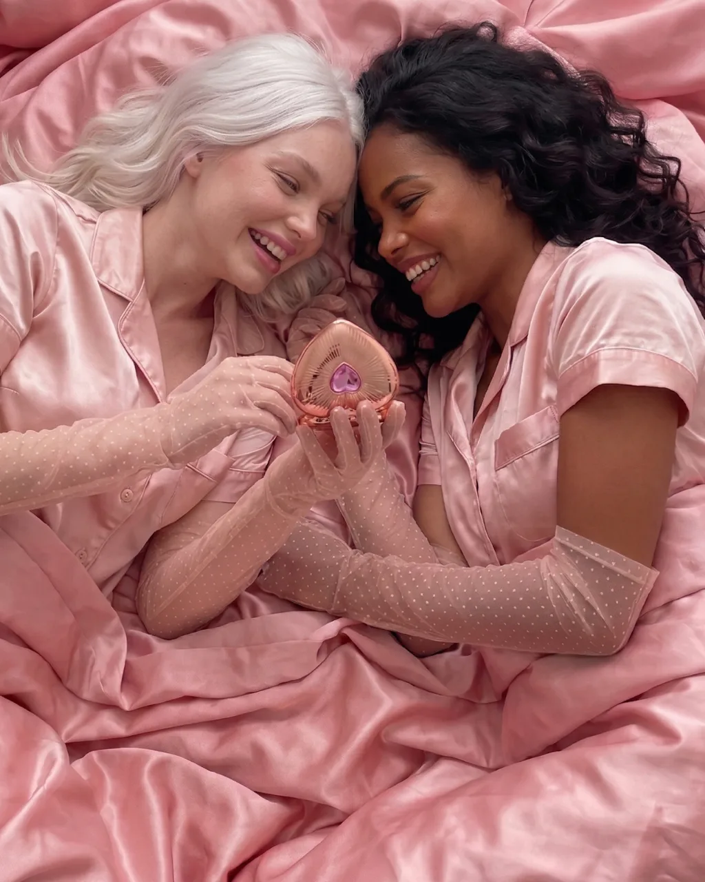
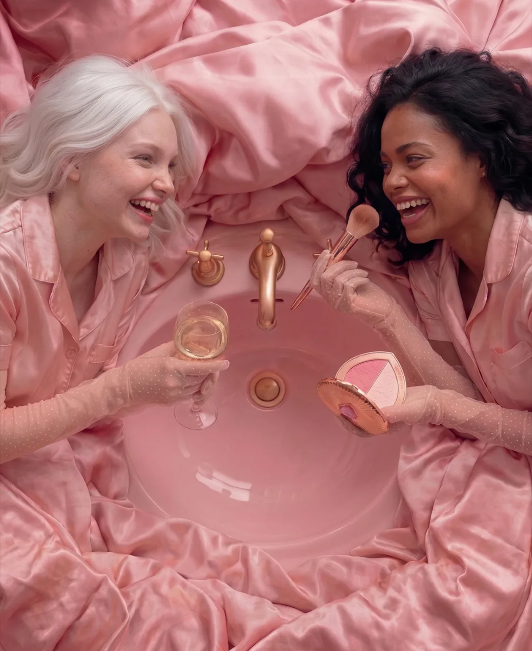
I built the story around two women and one heart-shaped blush compact. The concept is about sisterhood and recognising the beauty that's already there, with makeup as a way to highlight it. The playfulness comes from the two of them laughing together, and the product is in every frame.
The direction
Everything sits in one family of pinks, from the pressed powder to the silk sheets and the basin, held together by rose gold and soft light. I wanted the product frames and the people frames to look as if they came from one day on one set.
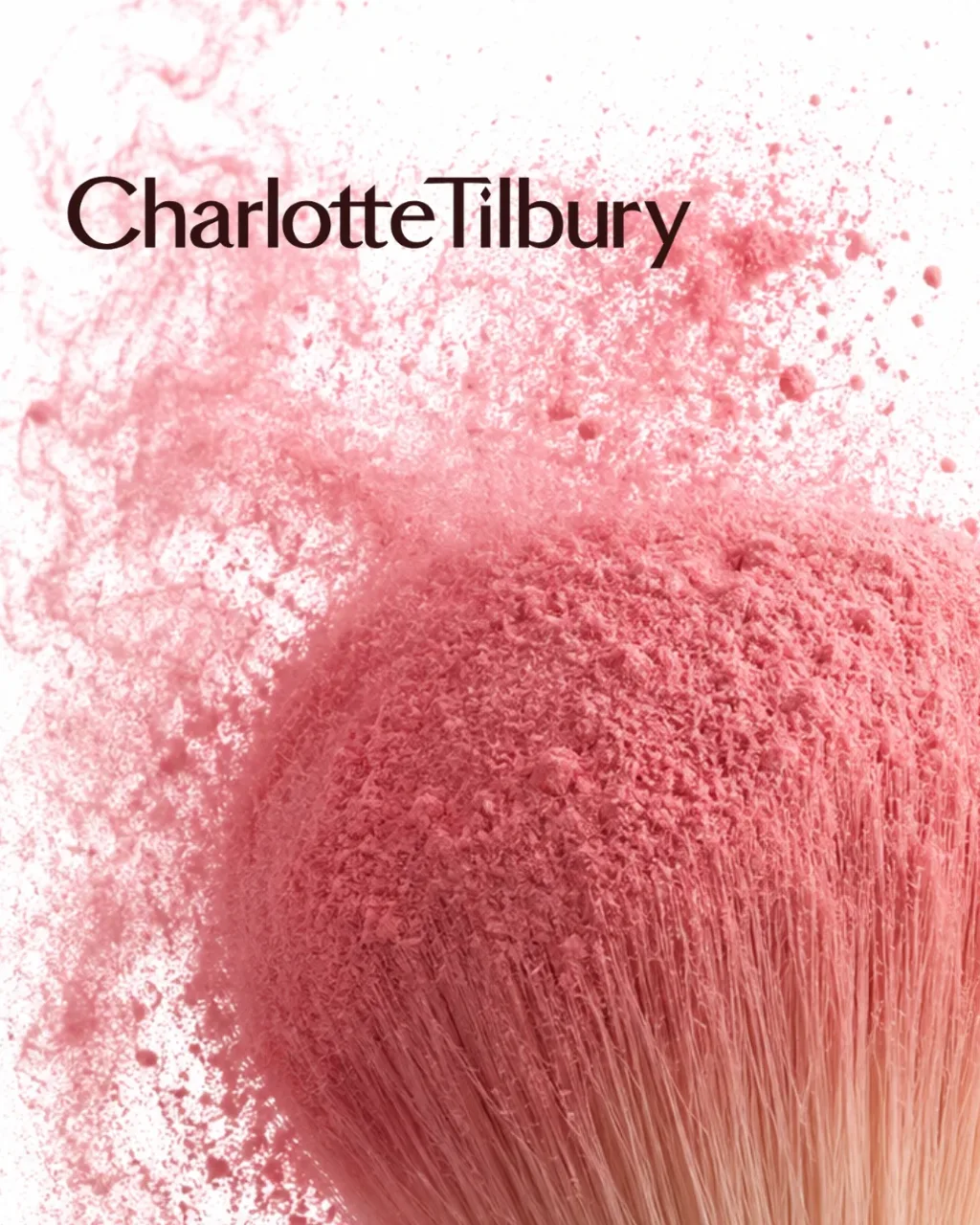
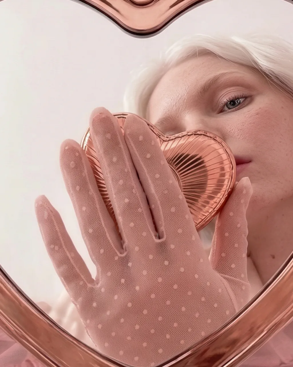
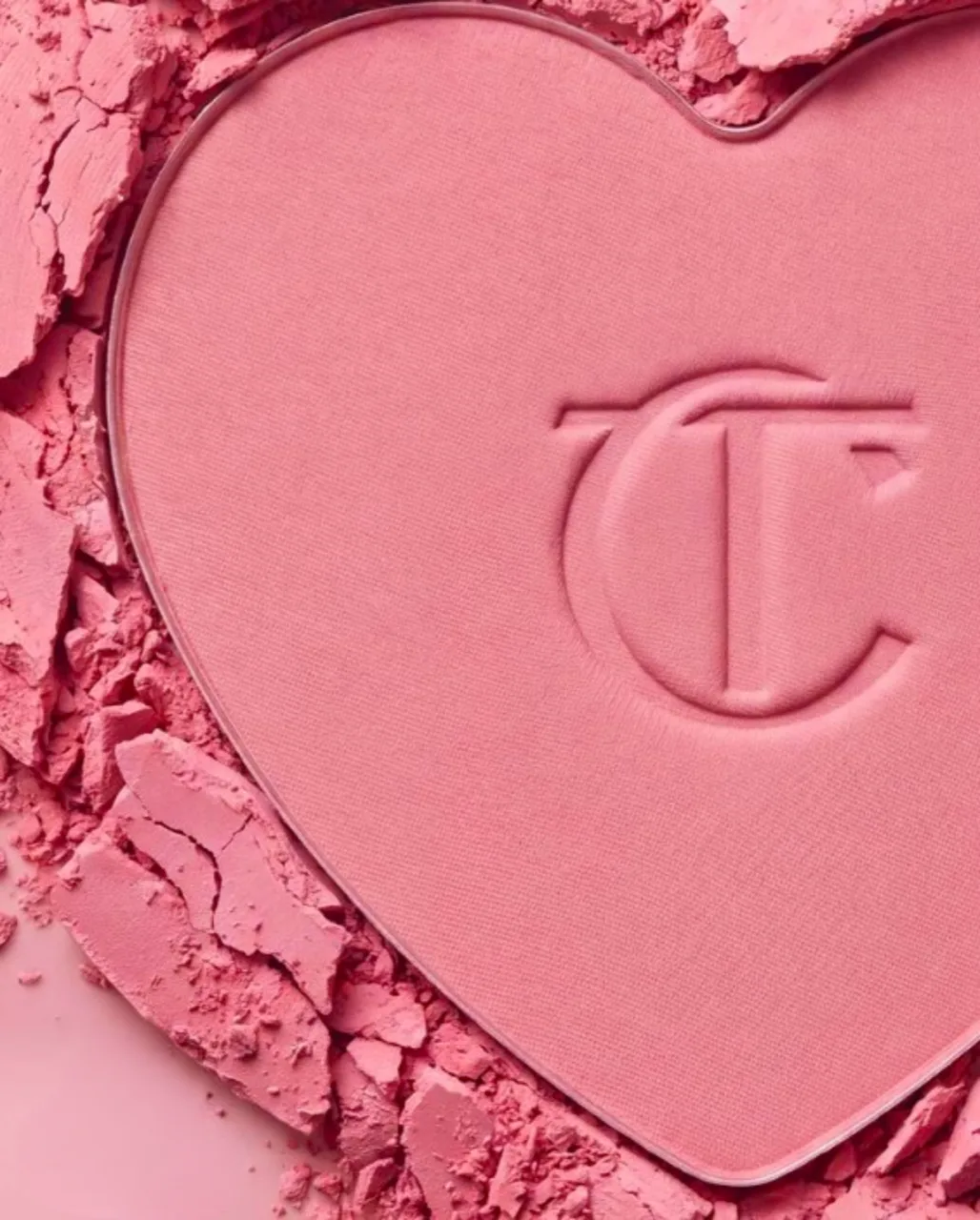
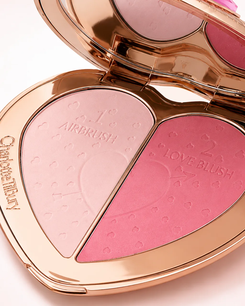
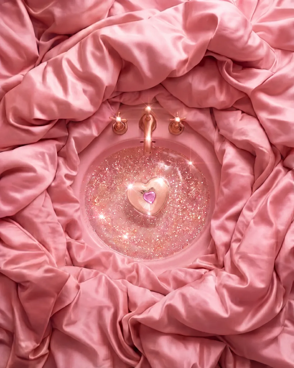
The product frames show the open compact, the closed compact floating in a basin of glittering water, the monogram pressed into the blush and a brush bursting with pigment. The people frames are a gloved hand holding the compact to her cheek, seen in a heart-shaped mirror, the two women lying on pink silk, and the two of them around the basin with a brush and a glass.
The casting carries the sisterhood idea. The two women have very different colouring, one platinum-haired and freckled, the other with dark curls, and both wear satin pyjamas and sheer polka-dot gloves. I kept the freckles and skin texture, because the idea I took from the brand is that makeup brings out what is already there.
What was hard
Texture is where makeup product photography gives itself away, and this set is full of it: pressed powder, loose pigment, satin, glitter in water and polished rose gold. Each had to look like itself in every frame it appears in.
The blush macro alone went through at least four versions, in more than one tool. The powder had to look pressed and dry, crumbling at the edge, with the monogram sharp inside it. In the key visual, the cloud coming off the brush had to read as loose pigment hanging in the air.
Colour was the other test. With pink from edge to edge, the blush had to stay its own pink against the silk and the basin, and the same shade had to sit naturally on two very different skin tones. I used the blush itself as the colour reference across all three images, keeping the pink consistent while allowing for how it naturally looks in powder, in the compact and on skin. At the end I matched the grade across all seven frames so they read as one campaign.