Creative product photography ideas that still sell
The brief says make it creative, and what comes back is a beautiful image where nobody can tell what is being sold. That is the failure mode of this whole category. Creative product photography is not about the product being less visible. It is about giving someone a reason to look at it for longer.
The test, before the ideas
Put your thumb over the logo. Can you still tell what the picture is advertising, and would you want it? If the answer is no, the idea has eaten the product.
It sounds crude, but it catches the most common problem in the category: creative gets interpreted as more. More props, more colour, more concept, until the product is one object among many and the eye has nowhere to land. Everything below is a way of being interesting that leaves the product in charge.
1. Put it somewhere it could not be
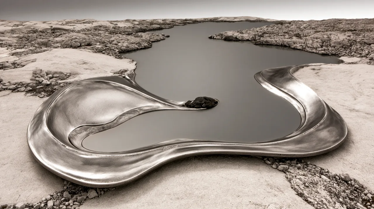
The most reliable way to make a product image interesting is to move it somewhere unexpected and then light it as if it belonged there. A silver form pressed into pale rock. A bottle on a ledge in one specific hour of afternoon light. A swimsuit on a lounger with the sea behind it. The Aesop Virēre concept does this with a bottle on wet rock in cave mist.
This is also where the money used to go, and what a launch set actually costs breaks that down. The discipline is that the place has to argue for the product rather than compete with it. Rock and metal share a hardness. Water and a hydrating serum share an obvious idea. If the location is just interesting, it is decoration. If it explains something about the product, it is direction.
2. Show what it does, not what it is
A serum in a bottle is a bottle. A drop of it hanging off a pipette, about to fall, is the product actually working. The behaviour is the claim: how slowly it moves, how it catches light, how it sits on skin. That drop is the whole idea of the HYDRA set.
This is the single biggest change you can make to a flat-looking set. Stop photographing the object and start photographing the moment it does its job. It applies to almost every category: lipstick breaking, cream spreading, fabric moving, glass fogging.
3. Change the scale
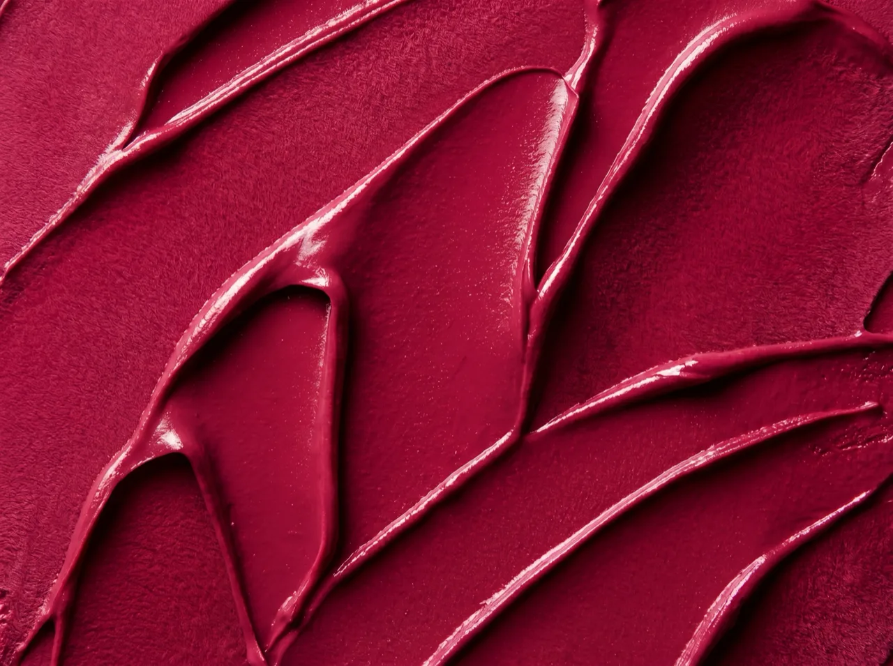
Go closer than a catalogue would. At macro distance a product stops being a thing you recognise and becomes a surface: pigment, weave, grain, the ridge where a lid meets a base. Texture is where desire lives, and it is the register most brands underuse because it does not look like a product shot.
One macro frame in a set of eight changes the rhythm of the whole thing. It also gives you something for the crops that would otherwise be a cropped hero.
4. Let a person carry it
Scale, warmth and use, all in one frame. A hand, a wrist, a mouth, someone mid-gesture rather than posed. Product on skin is the hardest thing to get right, because colour, finish and anatomy all have to be correct at once, which is exactly why it convinces when it works.
The rule that keeps this from becoming a fashion shot: the person should be doing something to the product or with it, not simply near it. Beauty is the hardest case, and what actually works in beauty product photography goes further into glass, finish and skin tone.
5. Build a world and stay in it
A single striking image is not a campaign. The interesting version of a product world is one you can shoot eight frames inside without running out: a palette, a quality of light, a set of materials, a time of day. Then every frame belongs, even the plain ones.
This is the part that separates a campaign from a folder of nice pictures, and it is the same argument I make about holding a consistent brand look across a whole set of images.
6. Use restraint as the idea
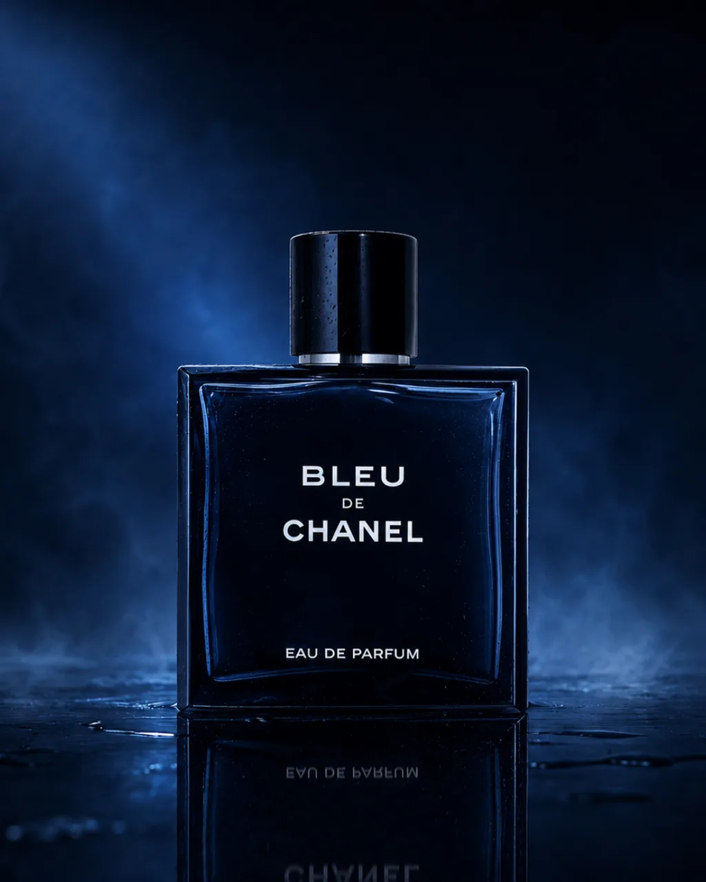
Sometimes the creative decision is to remove almost everything. One object, one ground, one light source, and nothing else in frame. Against a feed of maximalist product imagery, an image with real negative space in it is the one that stops the scroll. The still life in the Bleu de Chanel concept is exactly that: one bottle, one wet surface, one blue light.
Restraint is also the hardest to sell to a client who has asked for creative, which is why it helps to show it as one option in a set rather than the whole pitch.
Where to start
Not with the idea. With what the images have to do and where they are going, because a product page, an out-of-home poster and a launch story want different things from this list. Then choose the two that suit both the product and the placement, then build the world, then shoot everything inside it.
Done in that order, the interesting frames and the plain ones come from the same place and belong together. Done in the other order, you get a striking image and then a scramble to make everything else match it.
That order is the whole method at Bilder Studio, and it is why a set holds together rather than being assembled afterwards.