The brief
I chose Royal Pop to test luxury product photography on a watch designed to be worn in multiple ways. My concept builds on that versatility, exploring the watch as a pendant and an everyday accessory through colour and styling. Because it hangs from a cord, I wanted to know whether one watch could go into everyday settings and still stand up to a close look.
Royal Pop is a real collection from the Audemars Piguet and Swatch collaboration, octagonal pocket watches on stitched straps. This is a concept campaign I made on my own initiative, and neither brand commissioned it. I set up the test the way an online shop would meet it. A watch first needs a clean image on its own, the picture at the top of a product page. Then the same watch has to go into lifestyle frames, around a neck, on a bag or a key ring, without anything about it changing. If the dial softens or a screw disappears between the two, the product page and the campaign stop showing the same object. Everything in the set, the watches included, was made with AI.
The direction
I paired pop colour with everyday carry, hanging each watch from something you might wear or carry yourself. Most frames are close crops, lit softly and evenly so the dials stay readable.
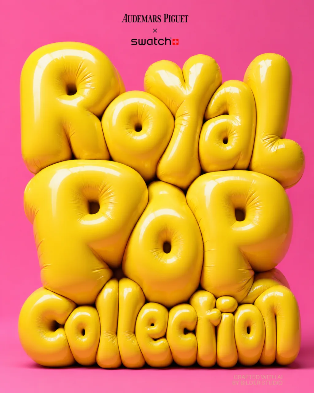
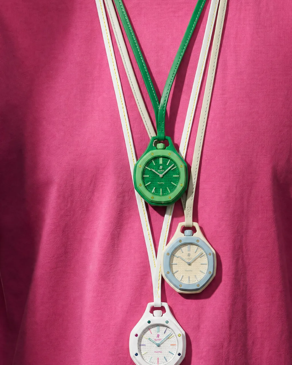
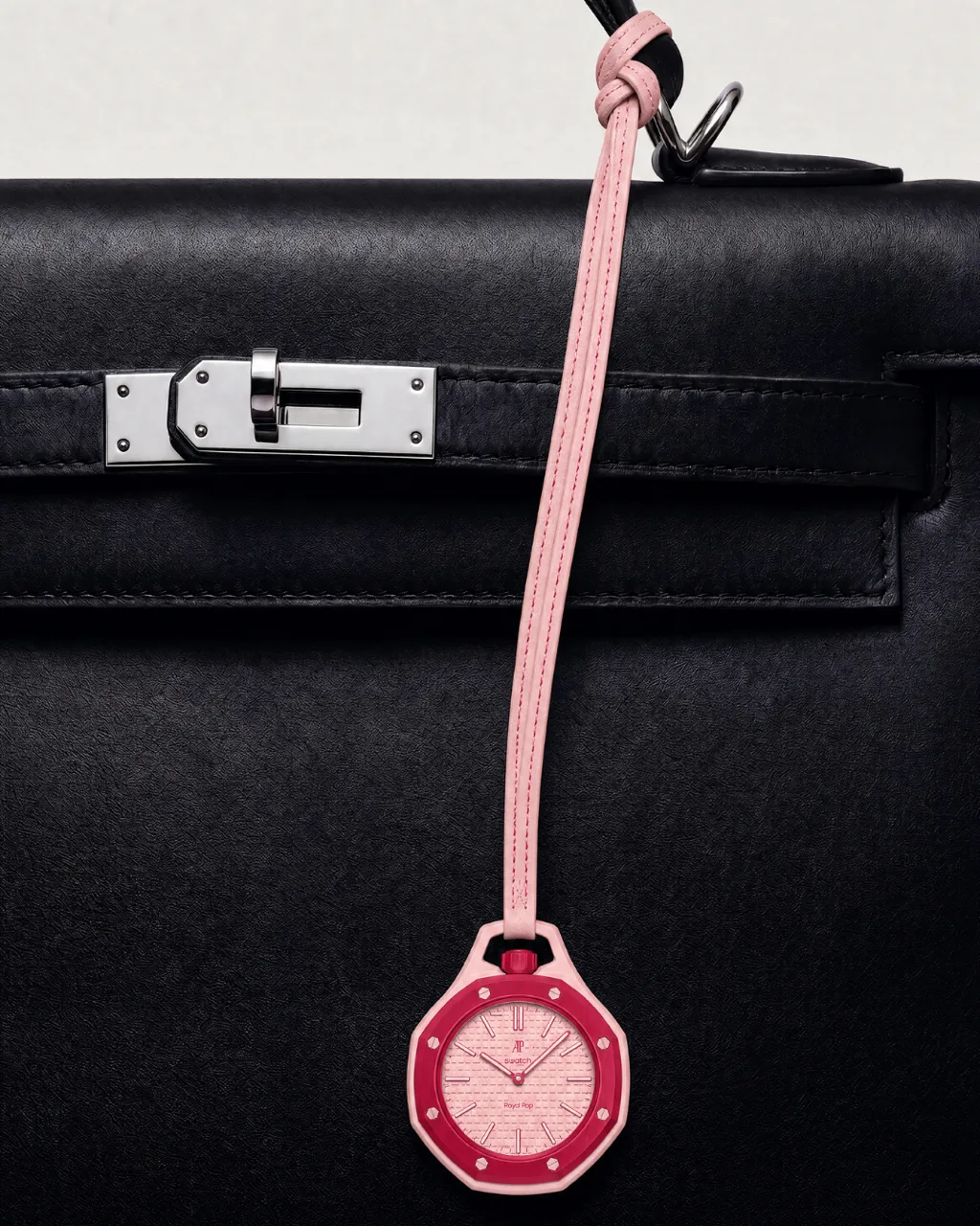
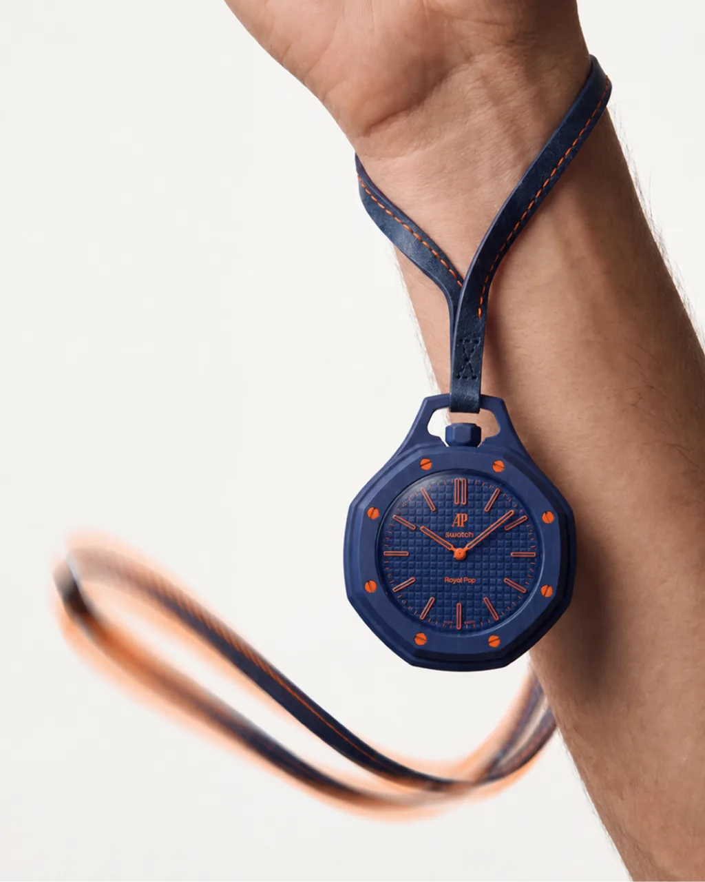
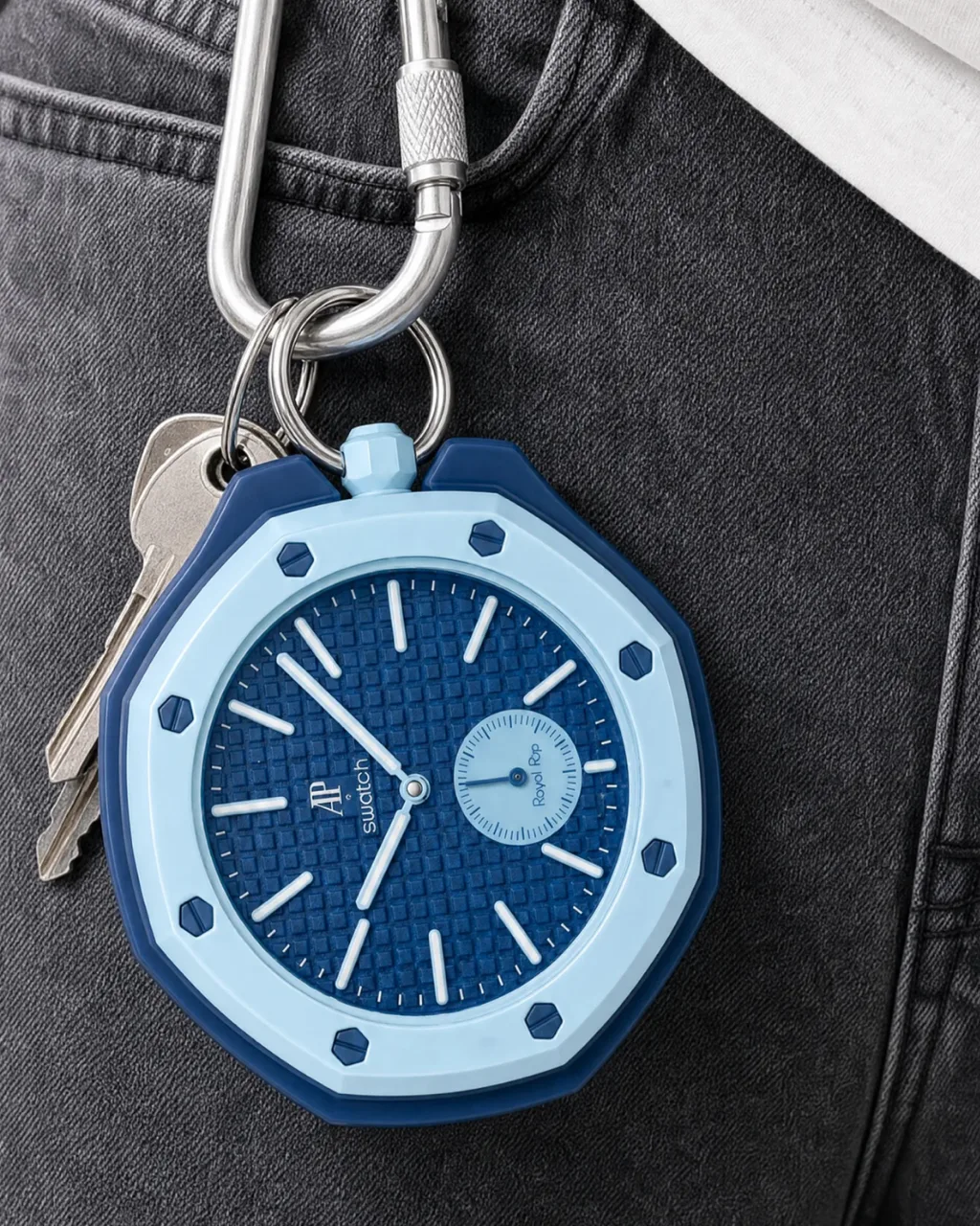
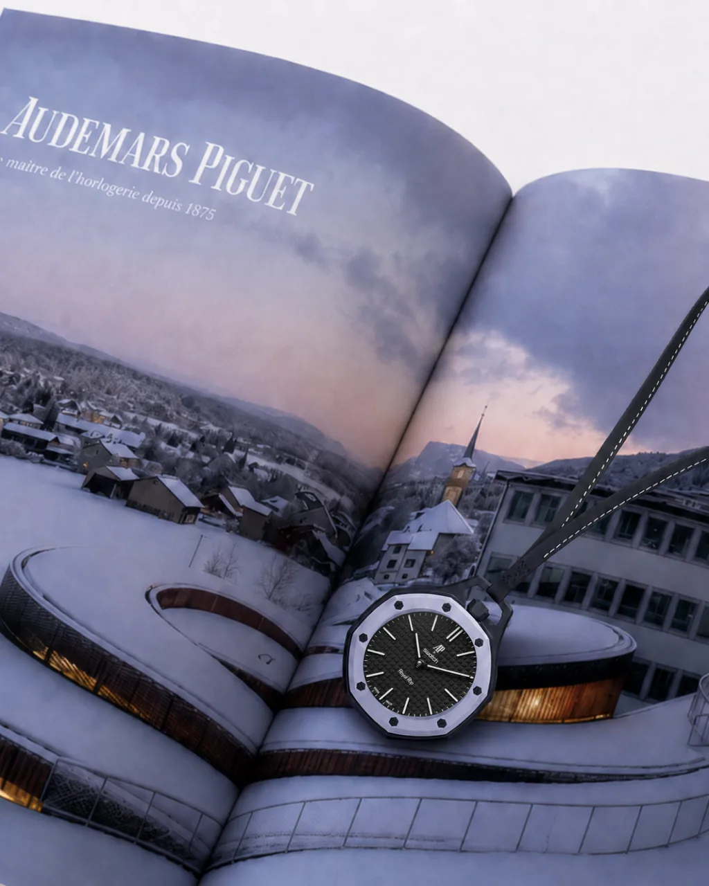
Three watches hang on cords against a fuchsia T-shirt. A pink and red one hangs from a black leather bag on a knotted strap, and a pale blue one is clipped with keys to a carabiner on grey denim. A navy watch swings from a cord at the wrist, the one frame with movement in it. The set closes on a black and white watch lying across a book open at a page on Audemars Piguet. The key art is my own, the collection's name in inflated yellow letters on hot pink, and its pink comes back in the fuchsia T-shirt of the next frame.
What was hard
Watches are where AI product photography is easiest to catch out, because the detail that matters is the size of a screw. Each watch also had to keep its own colours, the red bezel on the pink case and the orange screws on the navy one, with the stitching on each strap in the right thread.
Some of the watches began as clean images on white, the frame a product page would use, and were then placed into the scenes, so each scene started from a finished product. The bag frame was built separately, as an empty black bag, and the watch was added afterwards. My rule for the set was that every tiny detail had to survive the idea, down to screws you can count when you zoom in.