AI jewellery photography: what makes it work
I should say plainly that I do not shoot jewellery. I build jewellery imagery with AI and art-direct every frame by hand.
But AI jewellery photography still has to obey the visual logic of the real materials it is imitating. Metal, stone, scale and the way a piece sits on the body all have to make sense. Get one of them wrong and the image can be beautiful, but the jewellery immediately feels synthetic.
That is what makes this category difficult. Jewellery is often several materials with completely different relationships to light, packed into an object small enough for every mistake to matter.
Metal is a mirror with a shape
Polished silver gets much of its appearance from what it reflects.
You are not only looking at the metal. You are looking at the environment around it, bent across a curved surface.
A pale sky gives you long, soft gradients and a calm, expensive read. A dark surround gives you a bright edge and more drama. Give the surface nothing interesting to reflect and the result can become a flat grey object that looks closer to plastic than metal.
So the job is not simply lighting the jewellery. It is deciding what the jewellery is allowed to reflect.
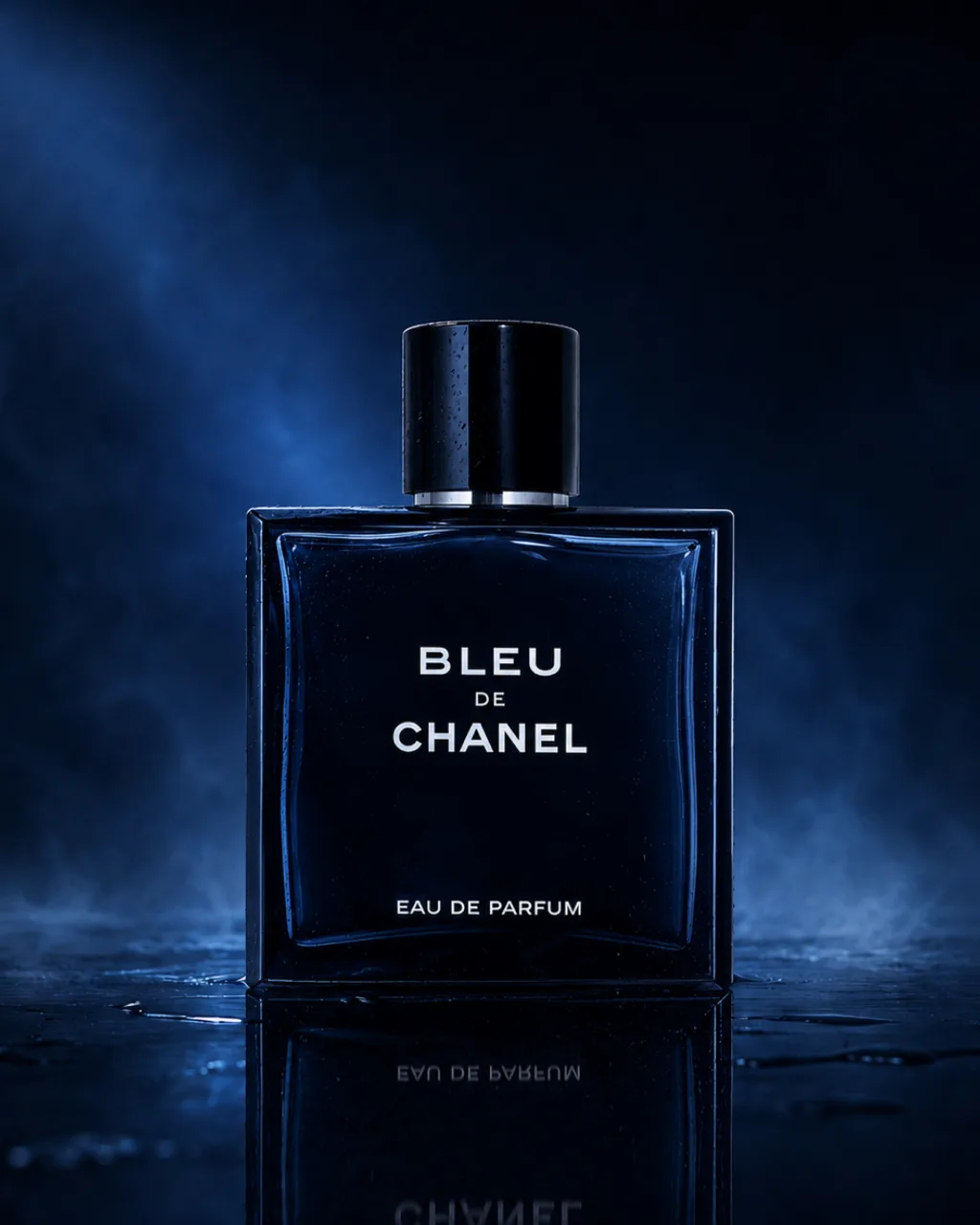
The same problem appears in fragrance photography. Glass and polished metal both reveal their surroundings as much as they reveal themselves, which is why the environment around a product matters even when that environment never appears directly in the final frame. The Audemars Piguet x Swatch charms are the same problem in miniature: small coloured cases and dials that have to hold their true colour against fuchsia and sage.
Stone is a different problem
Stone responds to light differently.
Some light reflects from the surface. Depending on the material, some enters it, is absorbed, scattered or refracted, and returns differently. That interaction of surface, colour and depth is what stops a stone from reading like a painted bead.
This is where jewellery becomes difficult, because the materials in one object can need different treatment. The metal needs reflections that describe its form. The stone needs enough information in the light to reveal its surface, colour and depth.
Flatten everything into the same lighting and one of those qualities usually disappears.
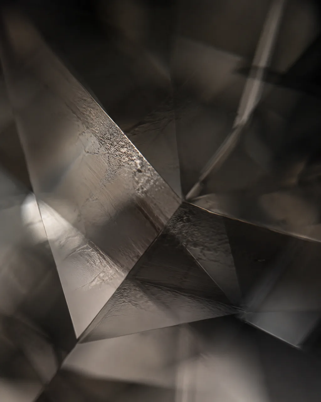
In OSSA, a fine jewellery brand concept I built from scratch, the grey stones are a large part of why the collection reads as material rather than simply product. The macro frames exist to show that depth, and for me they do as much work as the clean product images.
Metal needs reflections to describe its shape. Stone needs light that reveals its depth. Treat them as the same material and you lose both.
Nobody knows how big it is
A ring photographed alone against a plain ground has almost no scale. It could be tiny. It could be sculptural. There is nothing in the frame for the eye to measure it against.
And in jewellery, scale is part of the product. The difference between something delicate and something substantial can change how the piece feels completely.
Skin solves the problem instantly. So does a hand, a collarbone, a fingertip or even a fabric weave with a recognisable scale.
This is why a beautiful floating product image is not always enough. It might tell someone what the object looks like, while telling them very little about what will actually arrive in the box.
Jewellery has to be worn
A piece on a plinth tells you what it is. A piece on a body tells you what it does.
Where does the chain fall? How large does the ring feel on a hand? Does the earring disappear into a look or become the first thing you notice? Does the piece feel quiet up close but read as a statement from across a room?
Jewellery is designed to exist on a moving body. A launch made entirely from isolated product frames leaves the customer to imagine that half for themselves.
That is why the OSSA set moves between product, macro, worn and world rather than showing eight variations of the same necklace on a plain background.
The four images a jewellery launch actually needs
Most jewellery launches need fewer images than they think, but a wider spread than they usually plan for.
1. The product frame
Clean, honest and accurate to the piece. This is the image that has to survive being cropped into a product listing without relying on a dramatic environment to make it interesting. Shape, finish, stone placement and proportions have to hold.
2. The material macro
Close enough to see what the piece is actually made of. Metal finish. Setting. Surface. Stone. Small imperfections and tiny details that disappear at normal viewing distance. This is where material starts to justify value.
3. Worn
On a body, at the scale it actually exists. It answers the size question and the styling question at the same time.
4. The world
One image that tells me what kind of brand I am looking at. For OSSA, that became rock, skin and pale sky. The jewellery sits against landscape rather than competing with a heavily styled fashion world.
The product frame tells me what you sell. The world tells me why I should care that it came from you.
Four different jobs, one visual identity. Holding that identity across an entire set is the difficult part. It is the same discipline I use in AI beauty product photography, where the product can move between macro, model and campaign imagery without suddenly becoming a different object or a different brand.
Where AI jewellery photography becomes useful
Jewellery is particularly interesting to build with AI because so much of the traditional production around the piece can disappear.
There is no location to book for every new environment. No physical set to rebuild because the campaign direction changed. No need to bring the model, product, crew and landscape into the same place at the same time.
Once the jewellery is documented accurately, the world around it becomes much more flexible. The same piece can move from clean studio imagery to skin, landscape, still life or a completely fictional environment without rebuilding a physical production each time.
It also means imagery can begin before a finished piece exists. If a design is developed clearly enough, it can be visualised while the product itself is still being refined. In that case the campaign does not only document the finished design. The imagery can become part of the process of deciding what the design should feel like.
But AI does not remove the need for accuracy.
If the physical piece already exists, I want it documented properly from several angles before anything else happens. The front alone is not enough. I want the side, back, clasp, setting and the details most likely to be misunderstood.
Because a beautiful ring that quietly changes shape between frames is worse than having fewer images. Product fidelity comes first.
What I need to create AI jewellery imagery
If the piece already exists, start with plain reference photographs from several angles. Not campaign photographs. Not dramatic lighting. I need to understand the object first.
- The piece. Front, side and back, including details such as the clasp, setting or engraving where relevant.
- The materials. Tell me exactly what I am looking at. Polished and brushed silver should not behave identically. Neither should an opaque stone and a transparent one.
- The references. Two or three visual references you love, and ideally one you cannot stand. Knowing what a brand wants to avoid is often just as useful.
- The destination. Product listing, social, campaign launch, website hero, print or something else. A square e-commerce crop and a launch story are solving different problems.
From there, I start with the moodboard. We agree on the world before I render the campaign, then the first version is built from that direction rather than generating until something happens to look good.
If you are working out the budget as well as the creative direction, I have broken down what product photography actually costs separately.
The technology changes the production process. It does not change the thing I am looking for in the final frame: a piece of jewellery that still feels like itself, only placed inside a world worth looking at.