The brief
MUSE is a lipstick brand that exists only in these images. I invented it as my own concept brand to see whether AI beauty product photography could carry a complete launch, from the packaging through to the editorial portraits.
I positioned it as a premium lip colour brand for women aged 25 to 40 who see make-up as personal expression, the kind of brand that could sit in Sephora or Cult Beauty, and gave it the tagline "Not just colour. A signature." The range is lipstick only. I wanted a single product category to express an identity that is minimal and bold at the same time.
Everything in the set was made with AI, the model and the packaging included, and no client was involved. My aim was to show that this way of working can give an early-stage beauty brand commercial-grade imagery for a pitch deck or a first launch. The finished set covers brand identity, product design, texture and editorial portraiture.
The direction
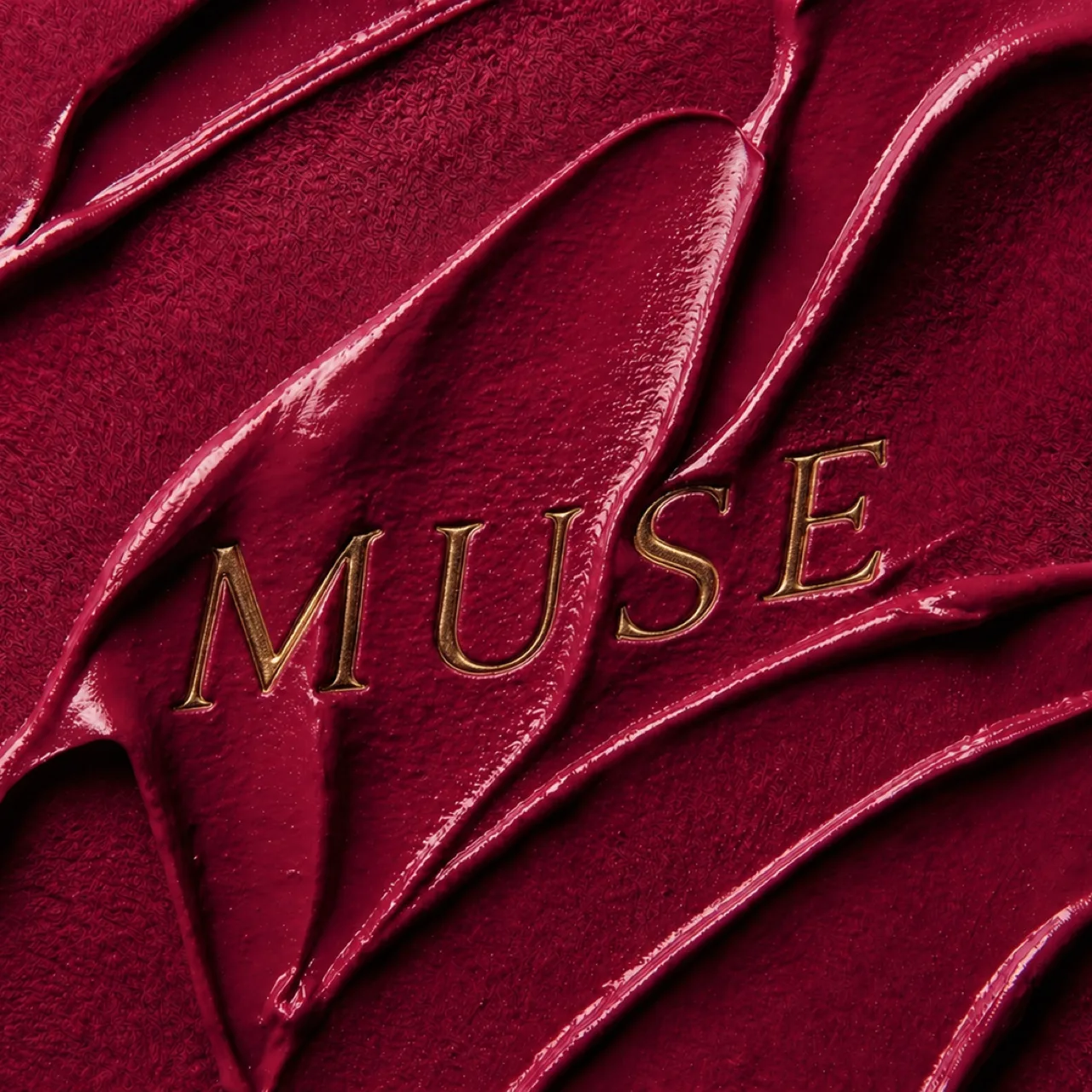
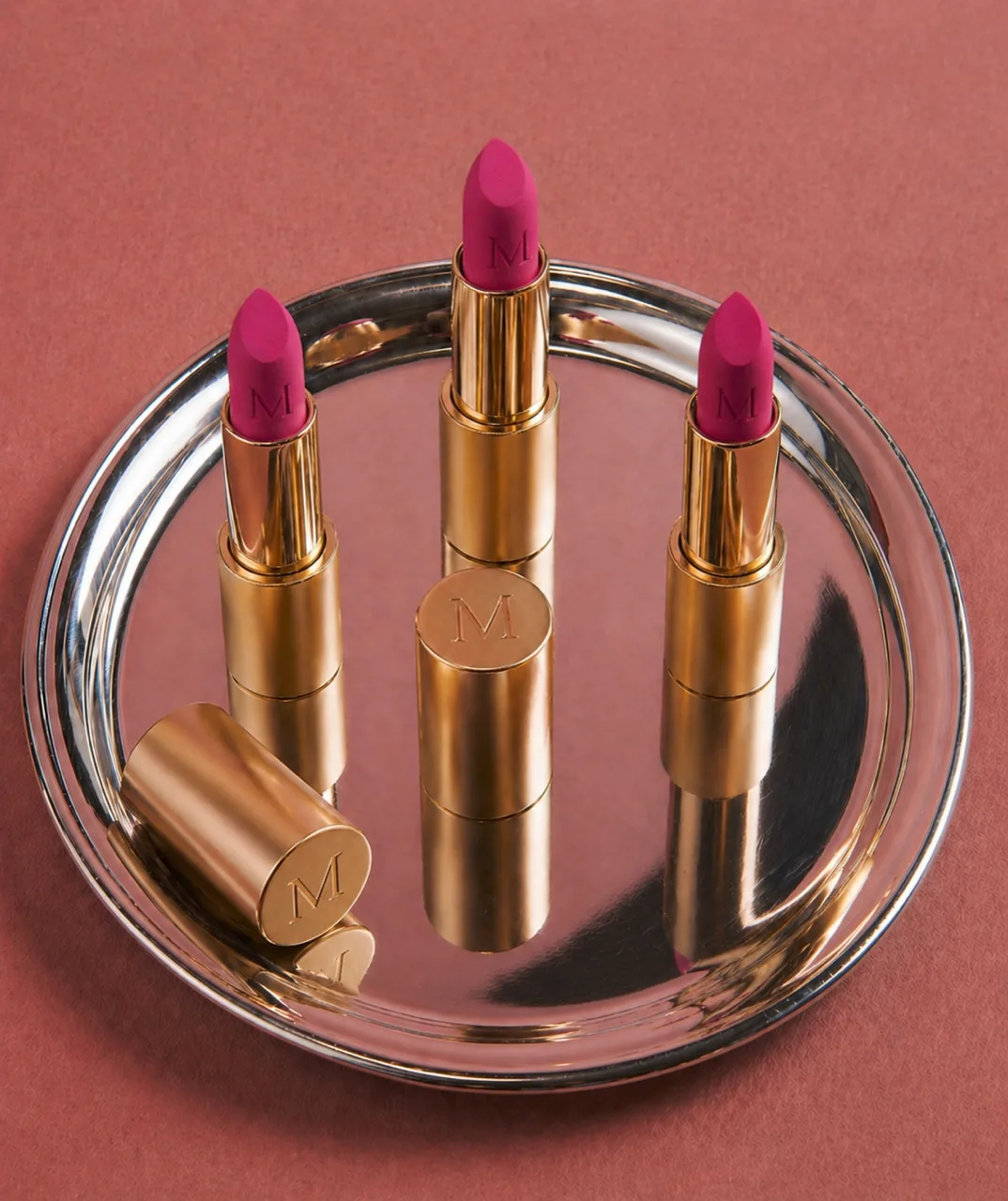
In the lipstick product photography, colour is the product and everything else is there to support it. The shades sit in rich raspberry tones, with a deeper red for the key visual, where the MUSE name is pressed into the lipstick itself.
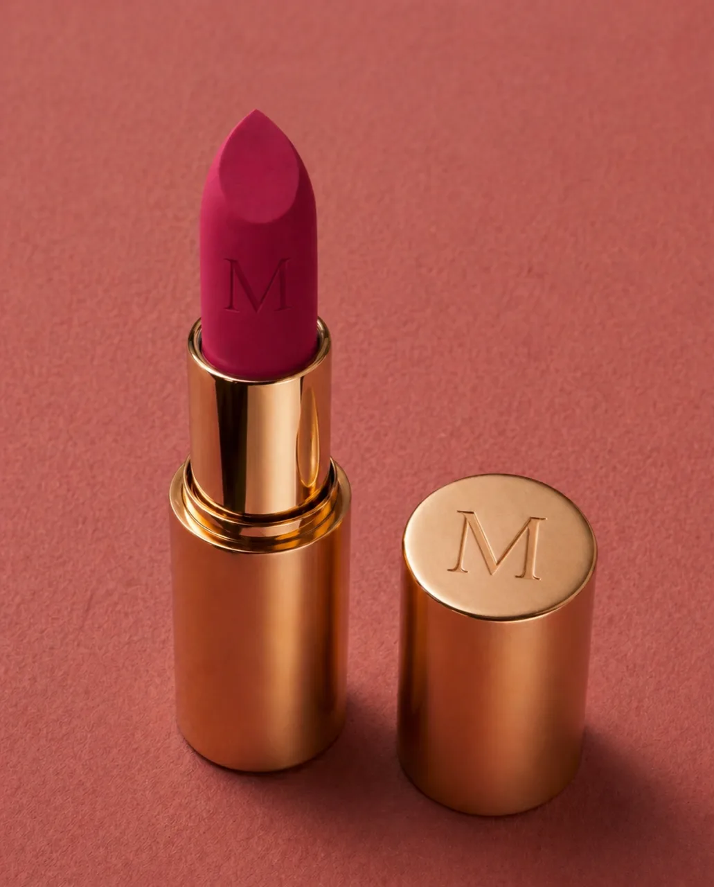
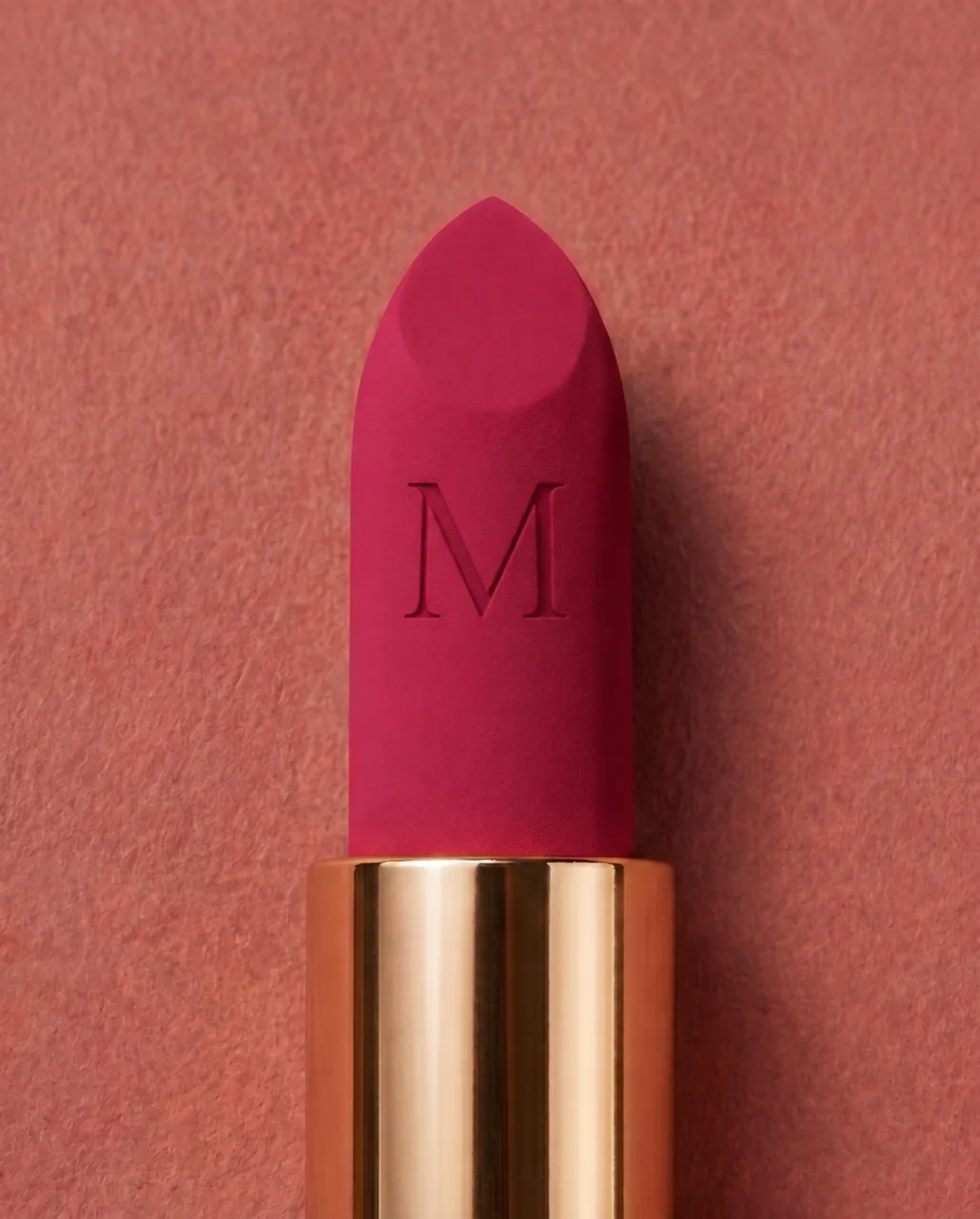
The case is brushed gold, with an M monogram on the lid and the same M pressed into the bullet. I treated the lipstick as a beauty essential and a statement object at once. The product frames are kept spare so the bullet reads as something sculptural, whether it stands alone in close-up or with the range on a mirrored tray.
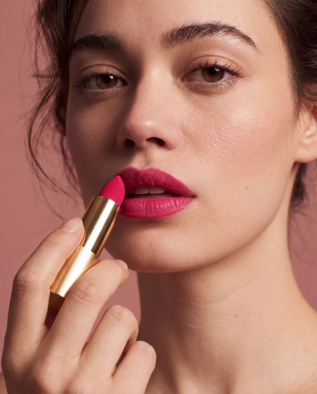
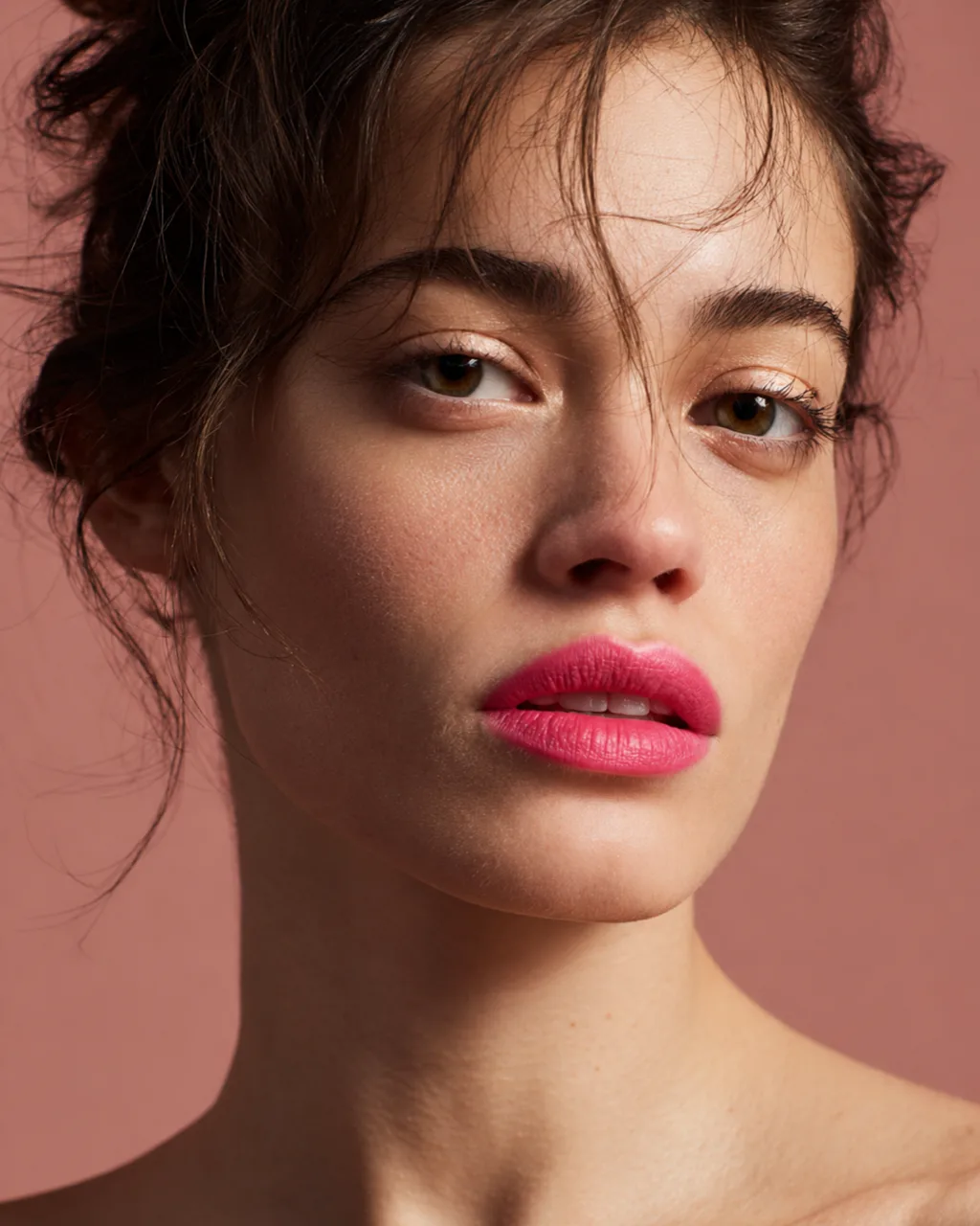
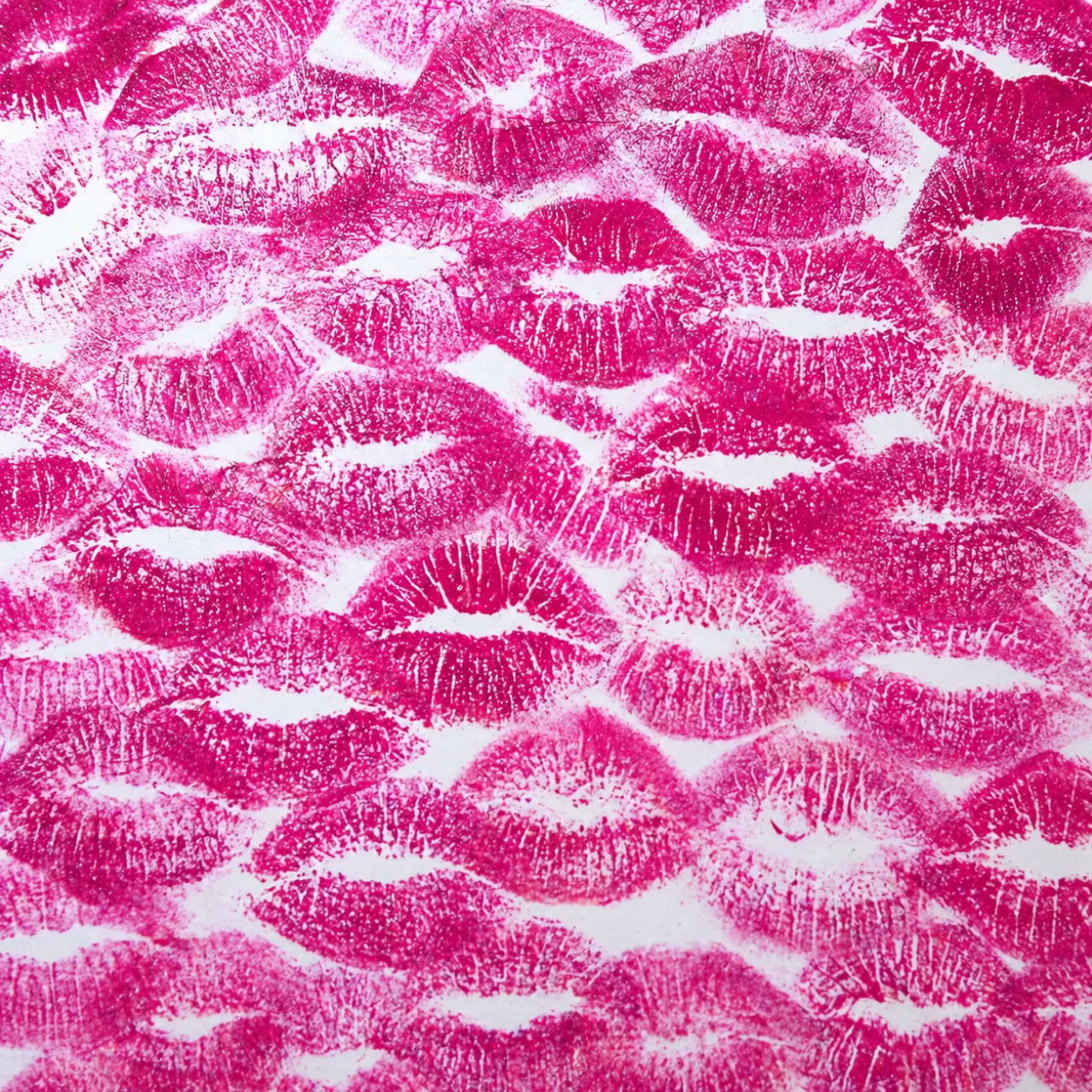
The product shots and the portraits share one plain terracotta backdrop, and against it the lip colour is the strongest thing in each frame. There is one model across the portraits, with dark hair loosely pinned up and her freckles and skin texture visible. One frame leaves the product out altogether and shows a sheet of paper covered in lipstick kisses.
What was hard
Colour accuracy was the hard part, because it had to hold across the whole set. A shade that looks right in the bullet can look wrong on the lips. It also had to survive the changes of scale, from the range on its tray to a macro of the lips.
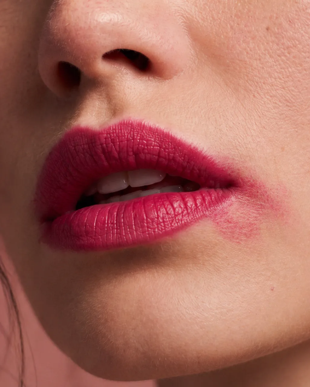
Product on skin is where this shows most. In the lips macro, the colour has to settle into the fine lines of the lips the way real lipstick does, and the finish has to match what the bullet promises. At that distance, a finish that reads wrong, or a shade half a tone too warm, is easy to see. I chose and defined the colour before developing the imagery, so I had a clear idea of the shade throughout the campaign. That gave me one reference for the bullet, the colour on the lips and the close-up texture images, and I retouched and colour-graded the finished frames in post-production to bring them into line with it. The final colour was something I directed and refined throughout.
Consistency was the other half. Getting one good lipstick image is the easy part. The work is a set where the case and the model agree from frame to frame, with one grade across the set so the images read as one shoot.