The brief
Moss and Salt is a fashion editorial I made with AI on my own initiative. The name is one I made up for it, and there is no brand or product behind it. The question I set myself was whether an AI fashion editorial could leave the skin alone, with its pores, freckles and flush, and still look finished.
Left to their defaults, the tools smooth skin and polish every surface until it looks plastic, and that look is a large part of why premium brands are nervous of AI imagery. I wanted to go the other way. The plan was one model on a grey stretch of coast, with everything in the frame wet and close enough to inspect.
The direction
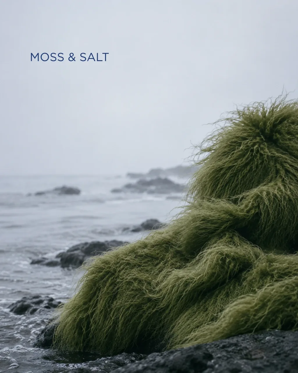
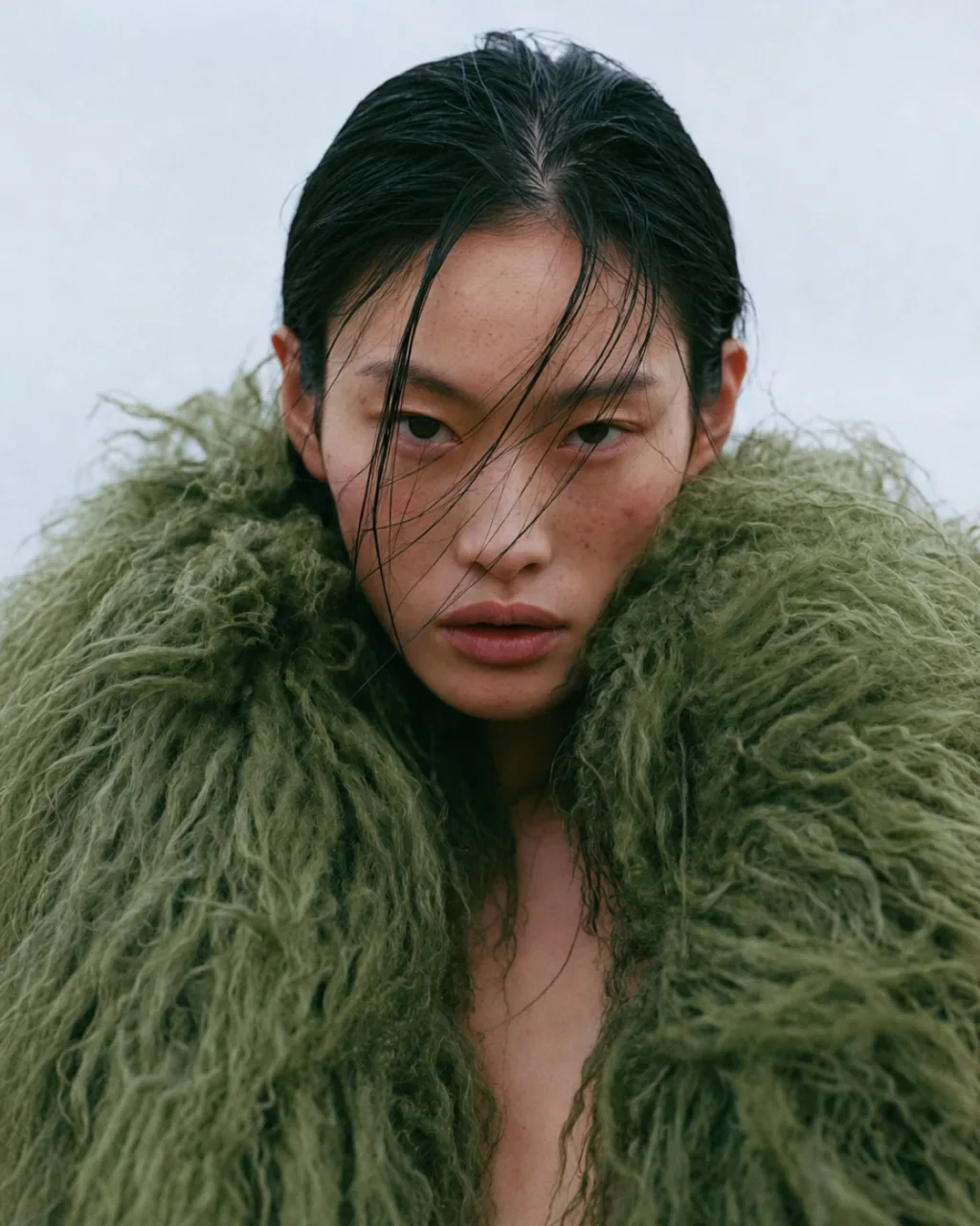
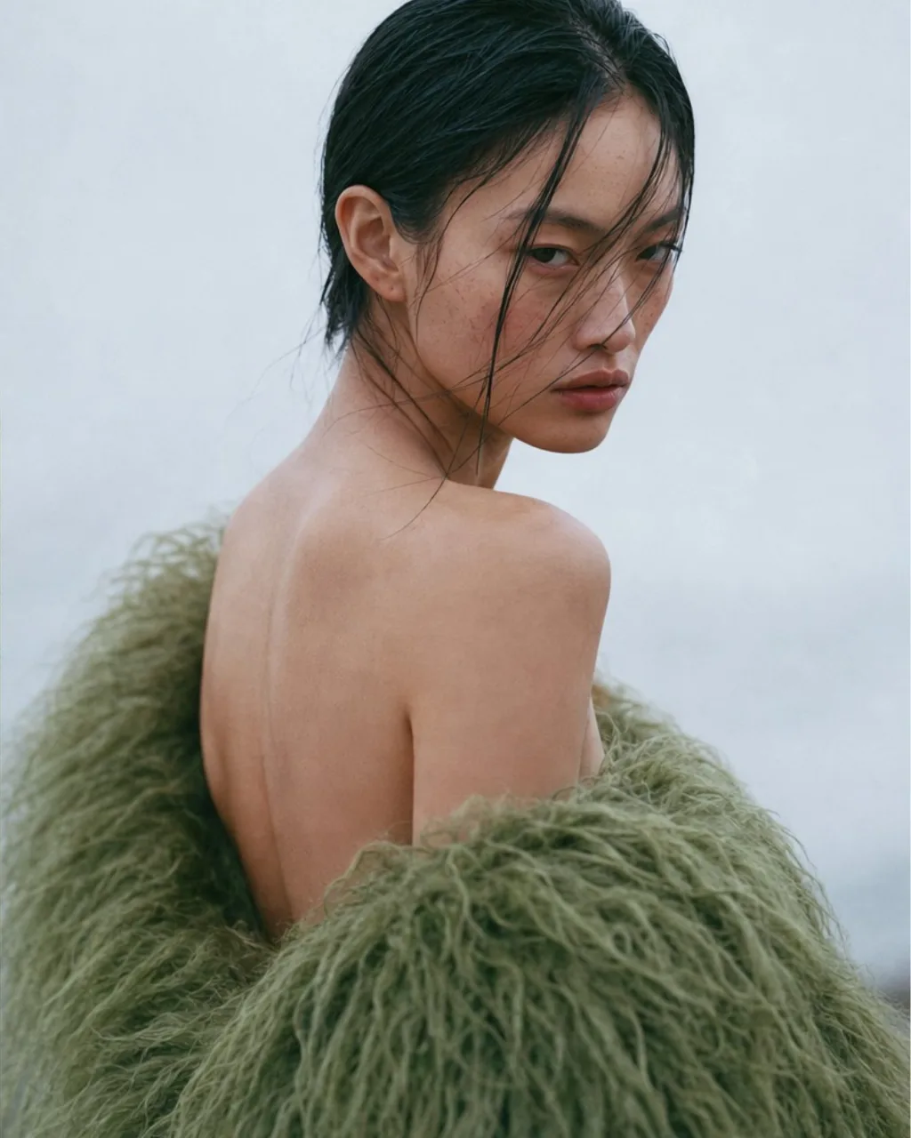
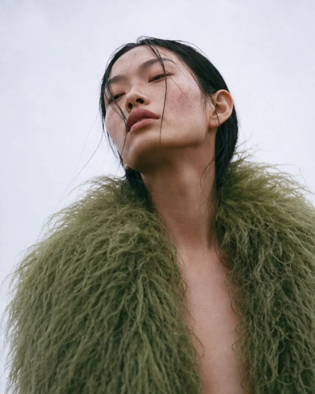
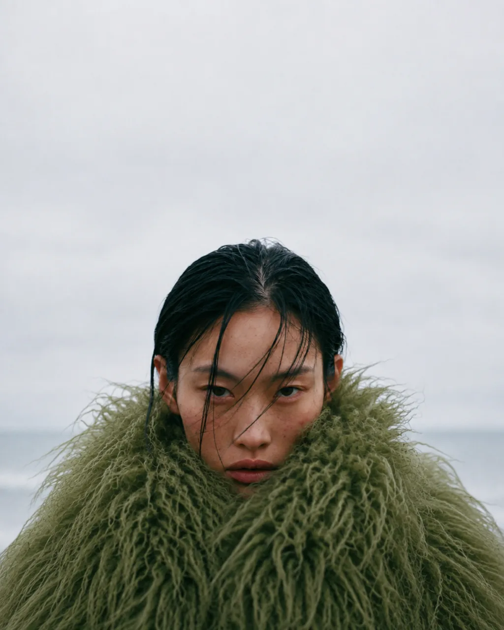
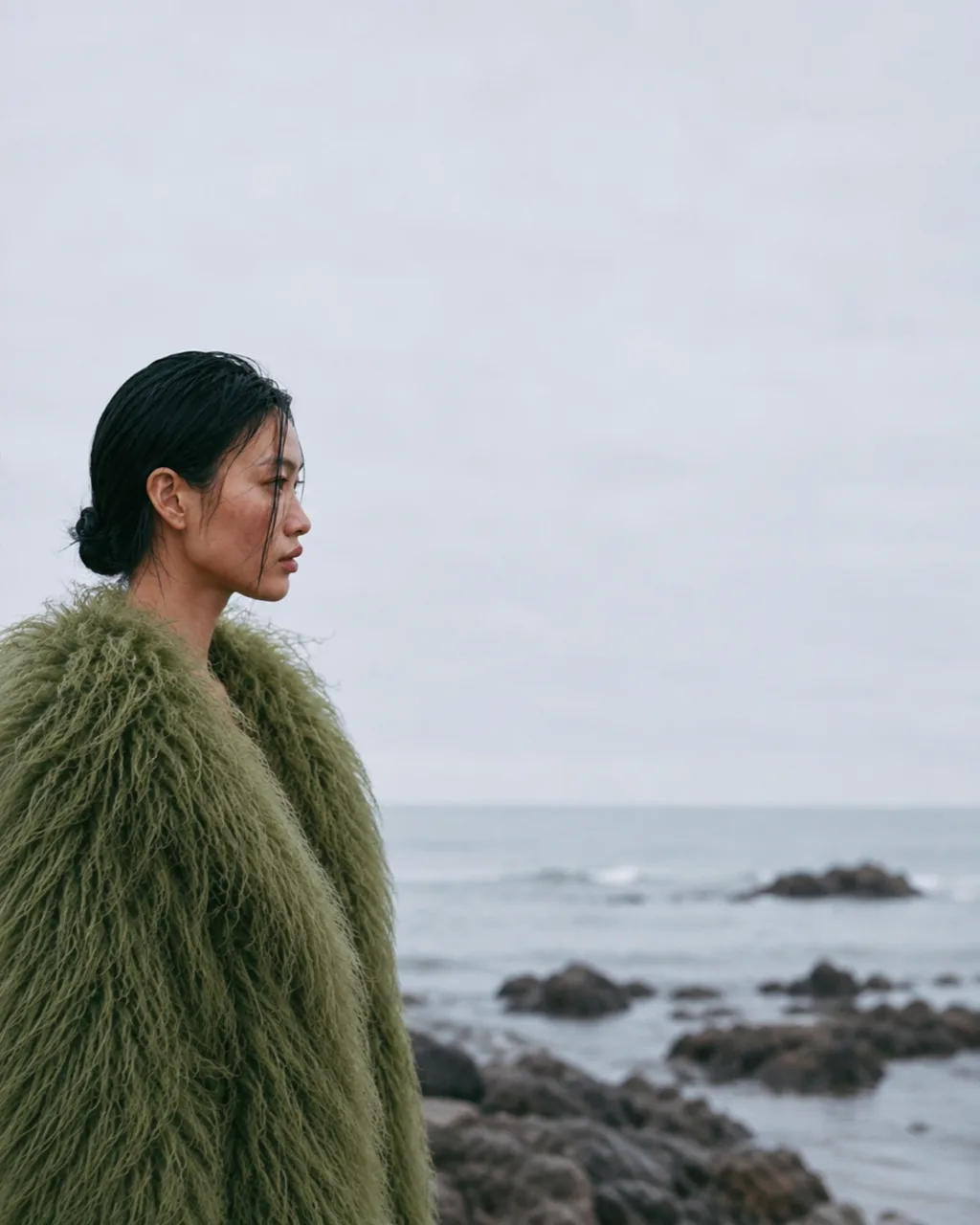
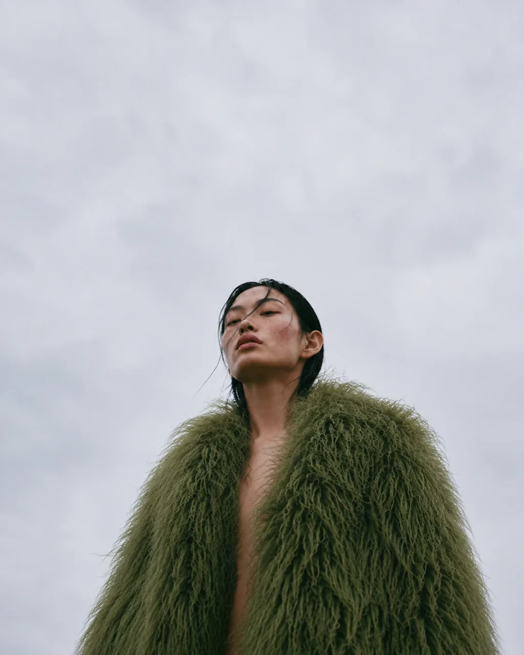
I kept the editorial imagery to one garment and one kind of weather. The model wears a long-haired green shearling coat open over bare skin, with no jewellery and nothing else in frame to compete with it. The coat carries the weather. Its pile looks damp and heavy. It slips off her shoulders when she looks back, and when she sinks into the collar it swallows her to the nose.
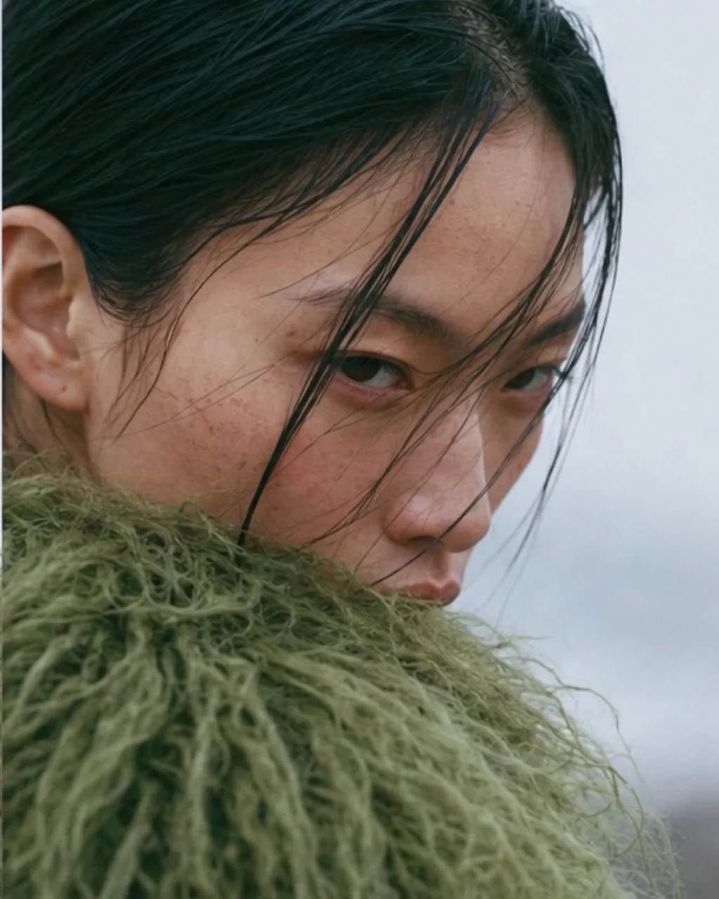
The light is flat and grey under a low sky, with sea mist softening the rocks and the horizon. Her hair is wet and slicked back, with loose strands left across her face, and her skin keeps its freckles and the flush on her cheeks. The frames move from close to far, from her eyes behind wet hair to a profile against the sea, and end with her small under a wide grey sky. The key visual leaves her out altogether and shows the coat alone, thrown over wet rock at the water's edge.
What was hard
Realistic skin was the test this AI fashion photography had to pass, and the close frames carried the most risk. In the crop with wet hair across her face, and in the one with her chin lifted into the mist, there is nowhere for a smoothed surface to hide. I watched for small losses, such as pores softening, freckles merging into an even tone and strands of wet hair setting into one glossy mass.
The coat had the same problem at a different scale. Its long pile could melt into a soft green blur the moment the detail went, and it had to look wet and heavy rather than freshly brushed. Choosing between frames came down to how much texture had survived. I treated texture as a selection criterion from the start, rejecting frames where surfaces looked overly smooth. Retouching was selective, correcting distractions while preserving the small irregularities that made the materials feel believable.