Where real texture comes from in AI imagery
Everything online is starting to look the same. AI removed the barrier to making images, and in its place left a sea of polished sameness. The way out is not a better tool or a cleverer prompt. It is where you look for inspiration in the first place.
The trap of looking only at screens
If your references come only from Pinterest boards, Instagram feeds and other AI images, you are feeding your eye recycled material. The algorithm just rearranges what already exists online, so the output drifts towards the average. Garbage in, garbage out applies to taste as much as to data. Prompt with generic internet language and you get generic internet images. Prompt with the vocabulary of a sculptor, a fashion designer or an architect, and something else starts to appear.
The fix is simple and a little old-fashioned: feed your own eye with real, tactile, physical things. Your inputs decide the ceiling of your outputs.
Three places I look that most people ignore
To build a look that feels genuinely premium, I gather most of my references away from the screen. Three sources do most of the work.
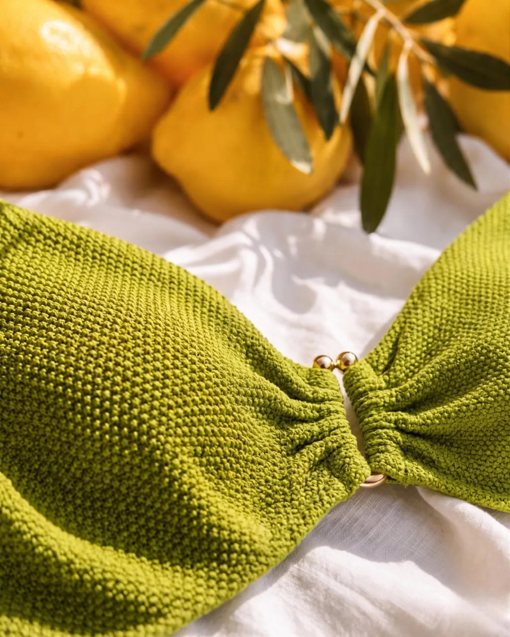
Couture, and how fabric moves. Not the clothes, the behaviour of the cloth: the weighted drape of a heavy wool coat, the light-catching crinkle of a sheer silk. Instead of asking the tool for "a sleek background", I direct it towards "the soft matte texture of raw Belgian linen" or "the structured folds of heavy cotton canvas". The image gains weight. The Moss and Salt editorial is that idea in eight frames: one green shearling shot wet, wind-blown and still. If you make clothes, this is how I work with fashion brands.
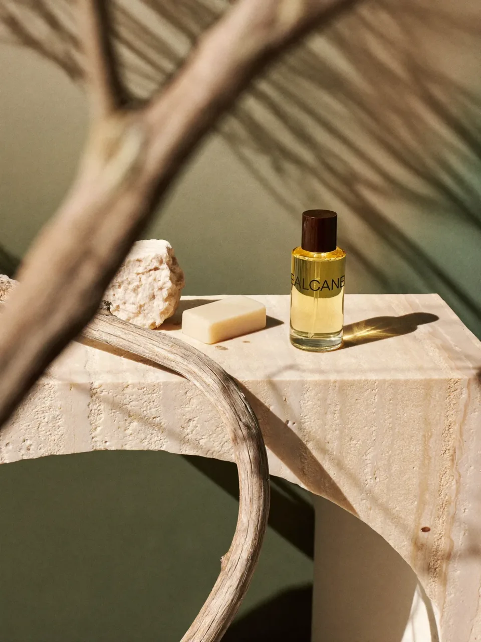
Architecture, and raw materials. Walk through a well-made space and watch how light meets the surfaces: the uneven glaze on hand-thrown ceramics, the cold of poured concrete, the warmth of wire-brushed oak. Bringing that specificity into direction changes everything. "Wabi-sabi plaster finish" or "honed travertine with natural pitting" gives a digital image an immediate sense of physical reality. The OSSA set grew out of a landscape study and a sketch for the same reason.
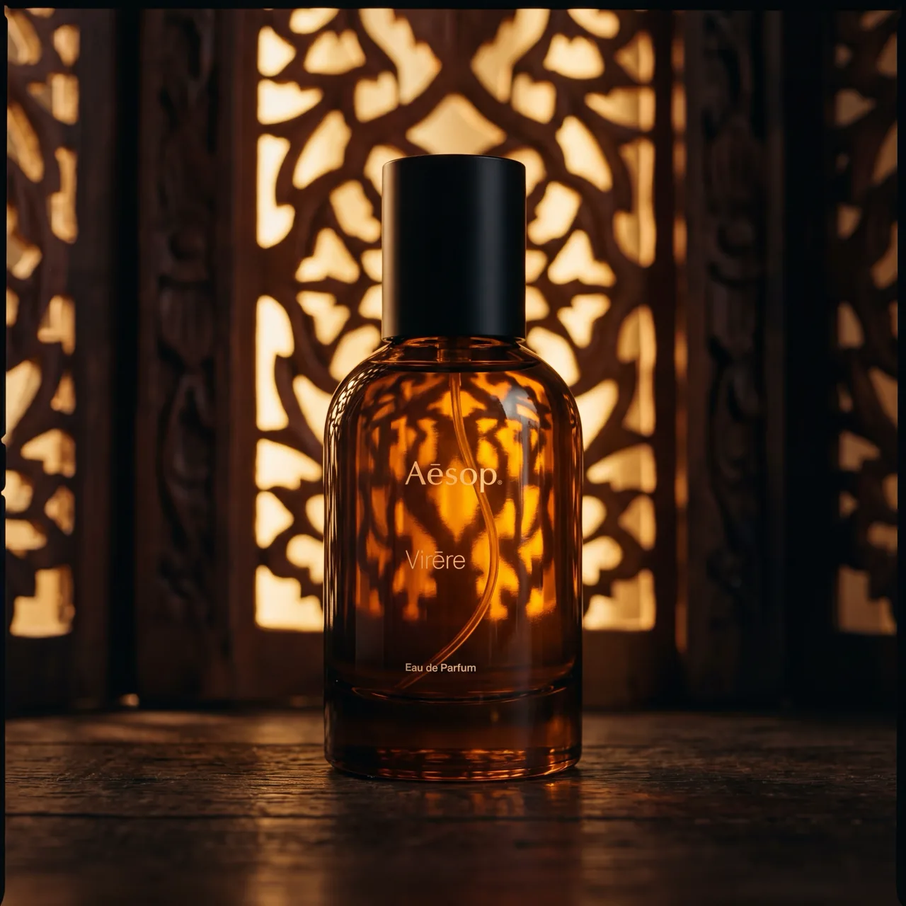
Perfume, and the language of scent. Houses like Aesop or Jo Malone do not sell smells, they sell atmospheres. They pair unexpected things, damp earth, smoky cedar, sharp citrus, to build a mood. I use the same sensory language to set the light and colour of a scene. Describe the air: is it "misty and cool, like a pine forest at dawn"? That kind of specificity pushes the tool into far more nuanced light and grading.
Taste is the filter
The tool does not know the difference between a cheap stock image and a considered editorial one. That distinction needs a human eye, trained by the physical world and a real feel for how things are made. Step away from the screen, gather from architecture, fashion and nature, and you can direct AI to build worlds that feel unmistakably real.
Finding the inspiration is only the first step. Translating tactile texture, architectural line and editorial mood into one coherent campaign is where the work actually is.
Common questions about texture and references
Why does so much AI imagery look the same?
Because most of it is referenced from the same place. If everything you feed a model comes off a screen, and everyone else is looking at the same screens, the output converges. Every model also has a default aesthetic, and shipping it unaltered is what produces the look people recognise as AI.
How do you get real texture into an AI image?
By looking at real things. Materials in daylight, worn surfaces, the way fabric behaves when it is not styled. Texture is a decision about what a surface has been through, and that has to come from observation rather than from another rendered image.
Where do your references come from?
Mostly not from other people's imagery. Physical materials, architecture, light at particular times of day, and things that were never made to be photographed. The point of looking away from the screen is to bring something back that is not already in the model.